Kintsugi is the Japanese tradition of repairing broken items with a resin material mixed with gold or silver. It is a way to highlight the flaws and imperfections in broken items as an event in the life of said item. All the sudden, the newly repaired item has life again, and a story to go along with it, to make it even more beautiful and more valuable than before.
5 Amazing Office Interiors
During the design phase of the office I'm wrapping up, I did quite a bit of research into office spaces. I don't work in a traditional 'office' (and I couldn't be happier about that, by the way) so this research was invaluable when it came to creating a space that made people enjoy coming into work, but also made them more productive while working. Below are five of my favorite office spaces that I came across, with a little description about the space and insight into the design. Enjoy the office envy!
Onefootball
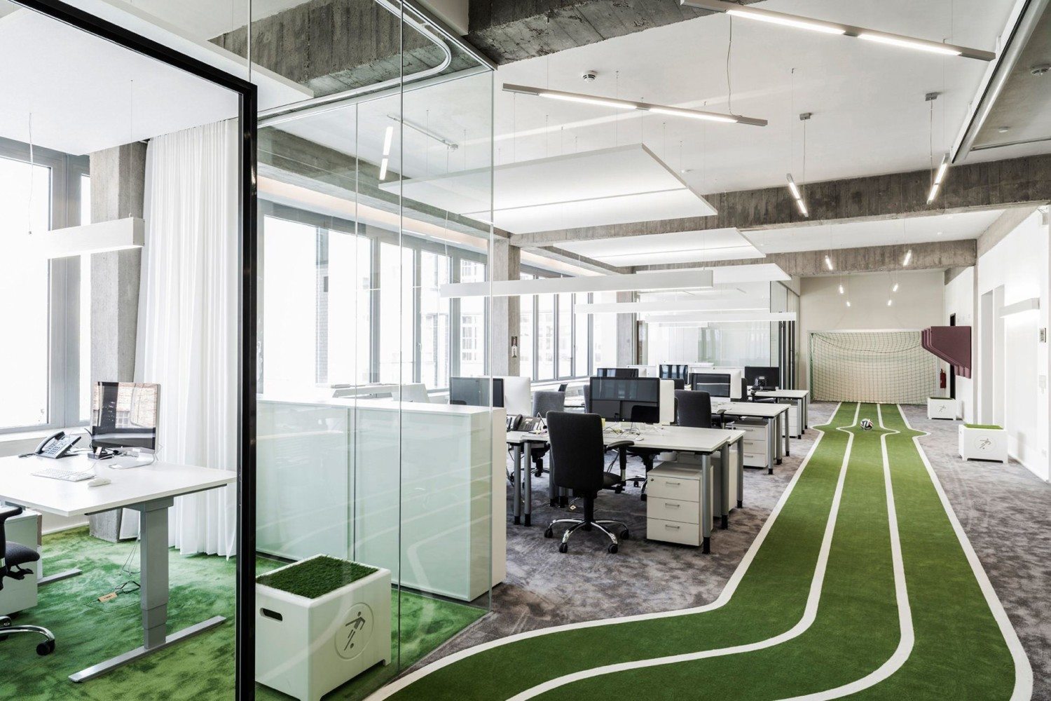
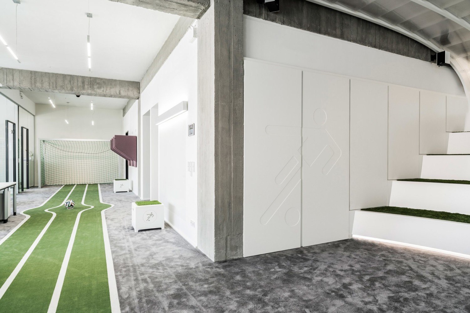
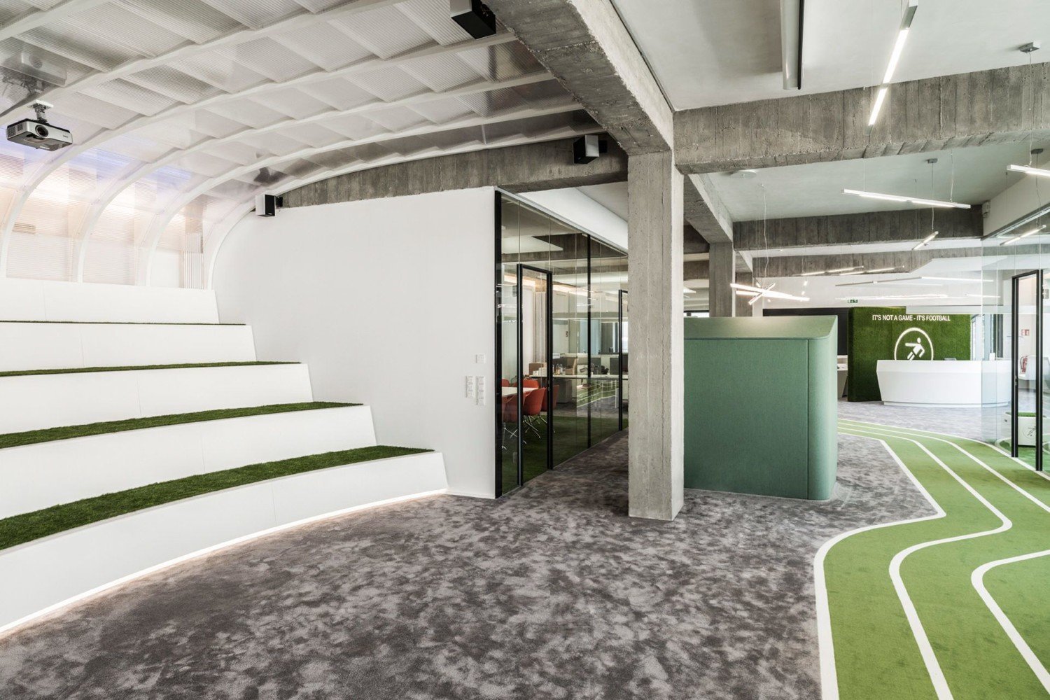
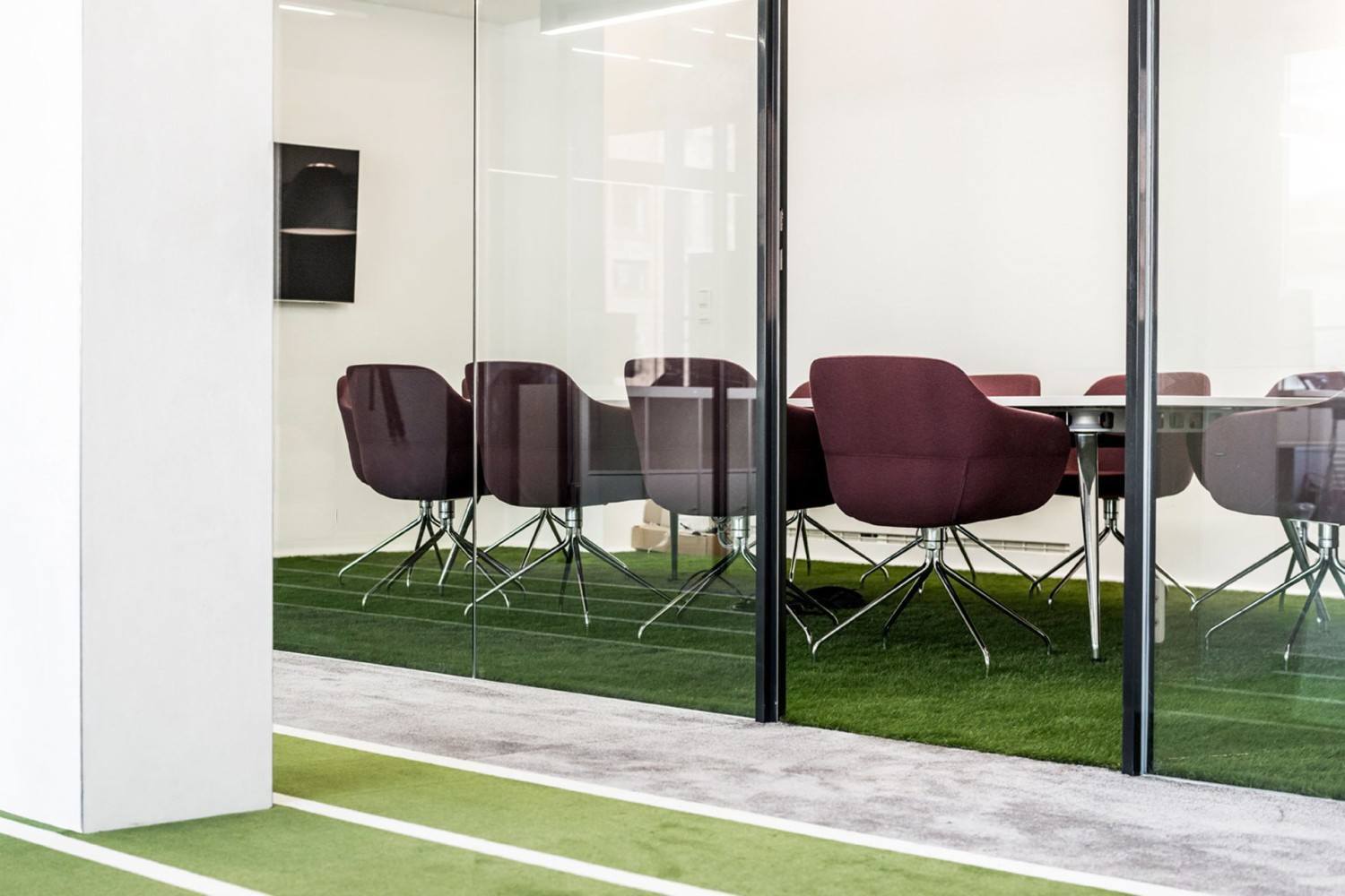
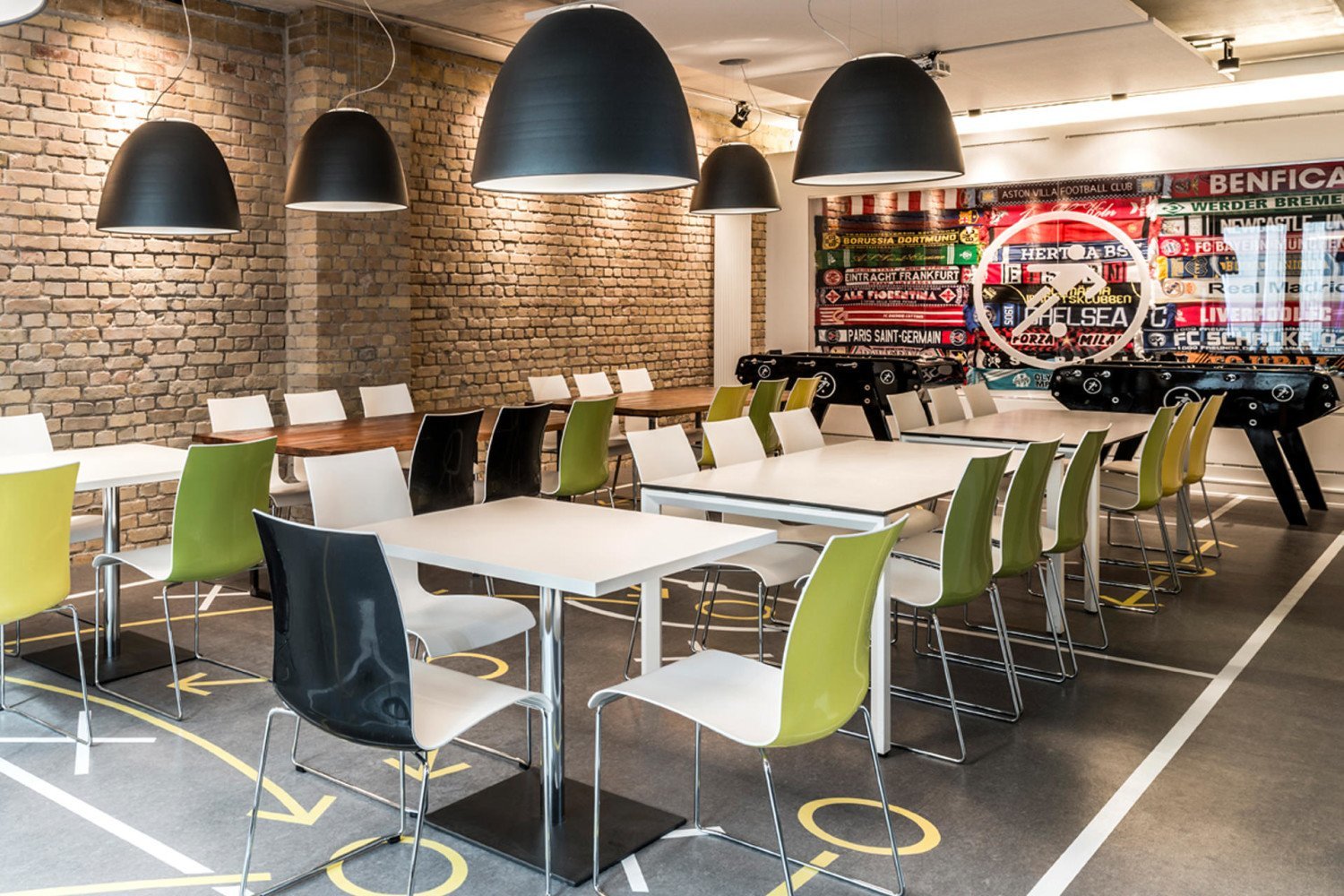
Headquartered in Berlin, Germany, Onefootball (Soccer, for us Americans) is a multimedia platform that connects fans to their teams/players with stats year round. According to TKEZ Architecture, the designers on the project, it was designed to be light, open, and multi-functional to represent the youth of the company and culture. They couldn't be more right. A turf track meanders through the space and terminates at a goal and net for employees to live out their dreams while blowing off some steam. Turf is also used throughout the work spaces to keep the business of sport in front of mind at all times. With glass partition walls everywhere, natural light is allowed to permeate the entire building and keeps the office vibrant and alive throughout the day.

Toms
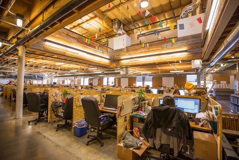
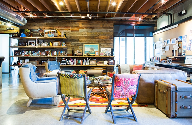
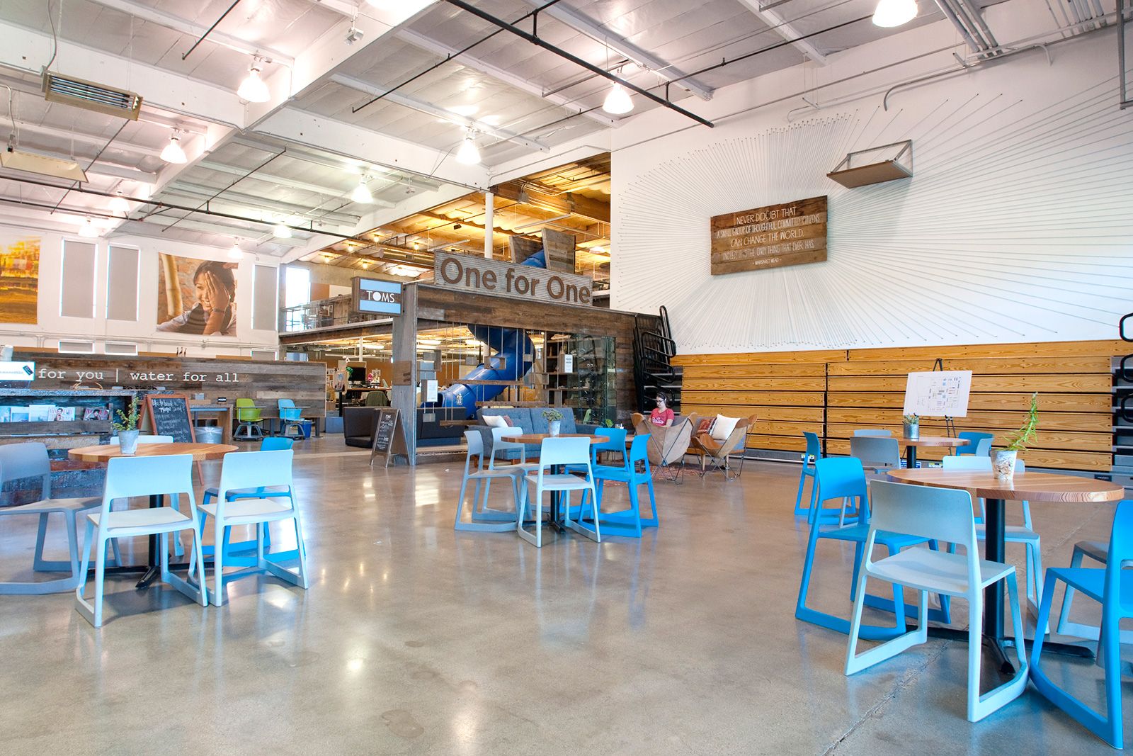
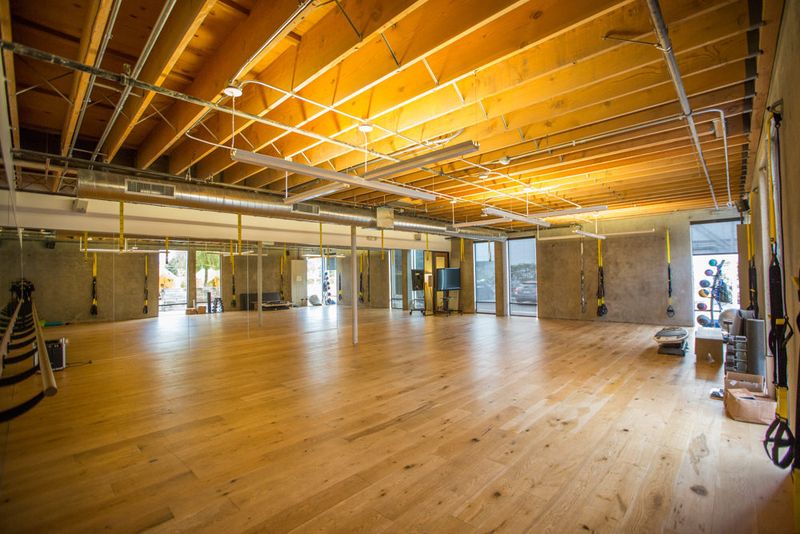
One thing almost every Tom's employee claims as a benefit of working at their new HQ in Marina del Rey, California, is that they all feel at home there. Looking through the pictures you can see why! 'Living room' areas with couches, club chairs, and rugs, their own coffee bar, tents in the 'back yard,' a full gym, slides as the best means to get downstairs, and they're even dog friendly!
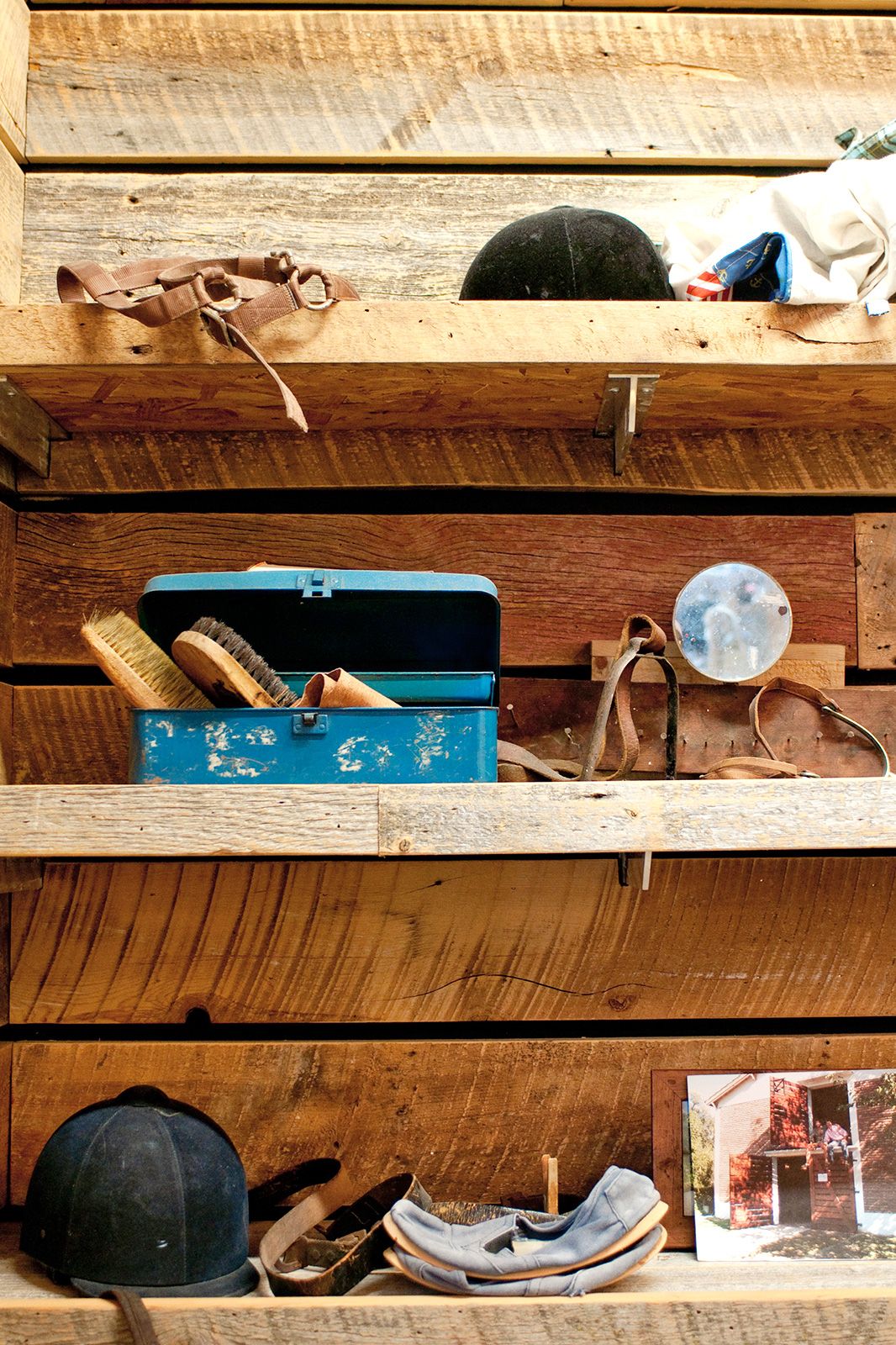
Tom's put a premium on cooperative work, and they encourage doing that work away from your own desks as much as possible. By keeping the spaces open and including as many small 'living room' areas as possible, they've made it comfortable for employees to do just that. Their well-adorned shelves, with carefully selected trinkets, add to the warm, family-friendly environment and make spending your time there enjoyable, as well as rewarding.



Selgascano
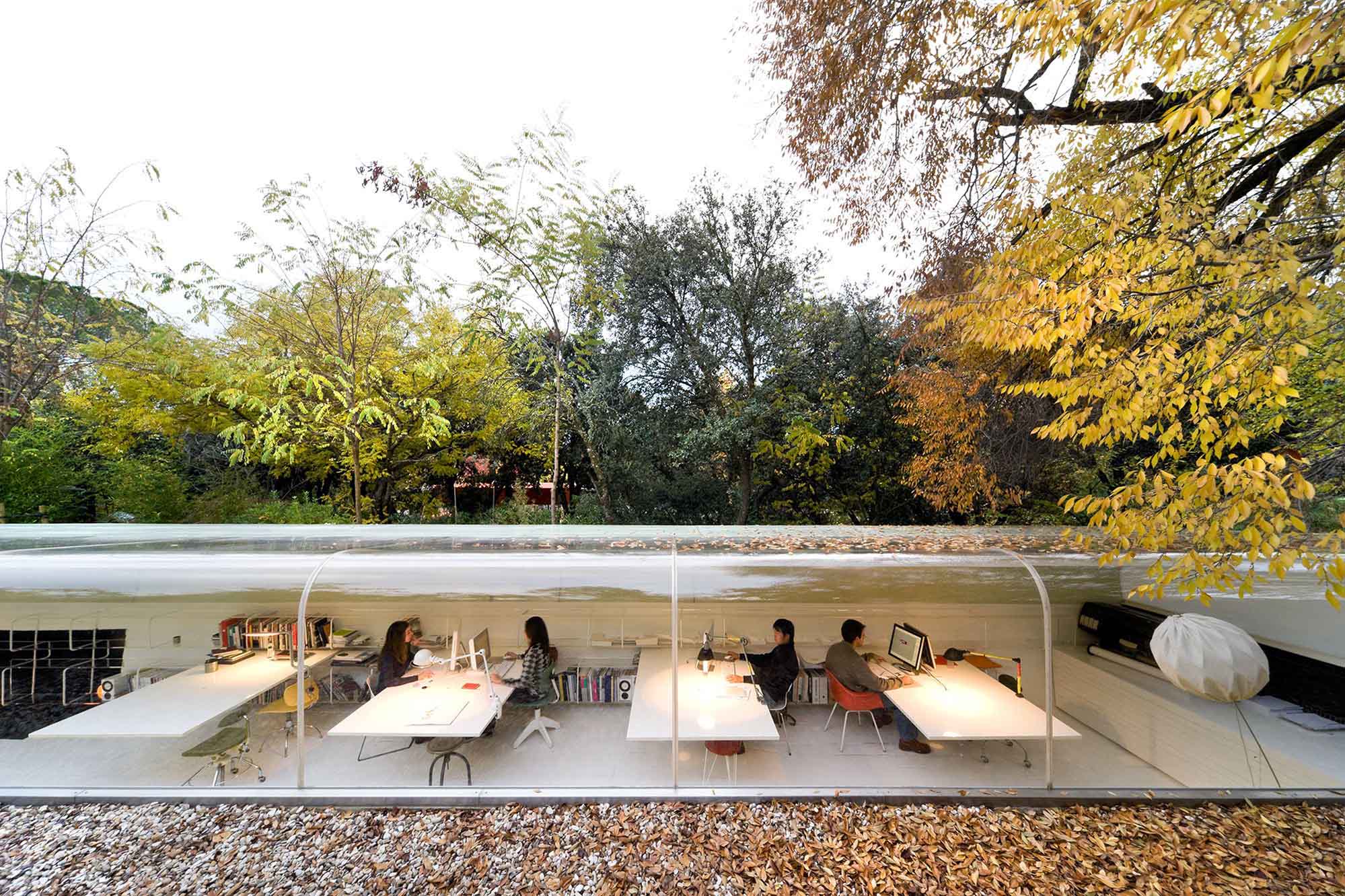
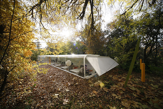
An architecture firm in Madrid, Spain, Selgascano has essentially dug a shallow hole to drop their office right into. Having half the building in the ground keeps the building temperate during the extremes of summer and winter. They've also allowed plenty of light to enter the office by curving the large main window up and rounding it over the top of the building, which also gives the employees wonderful views of the forest canopy above. The large amounts of natural light keeps the lights off more often than not which has a positive affect on productivity during the work day and improves overall performance.


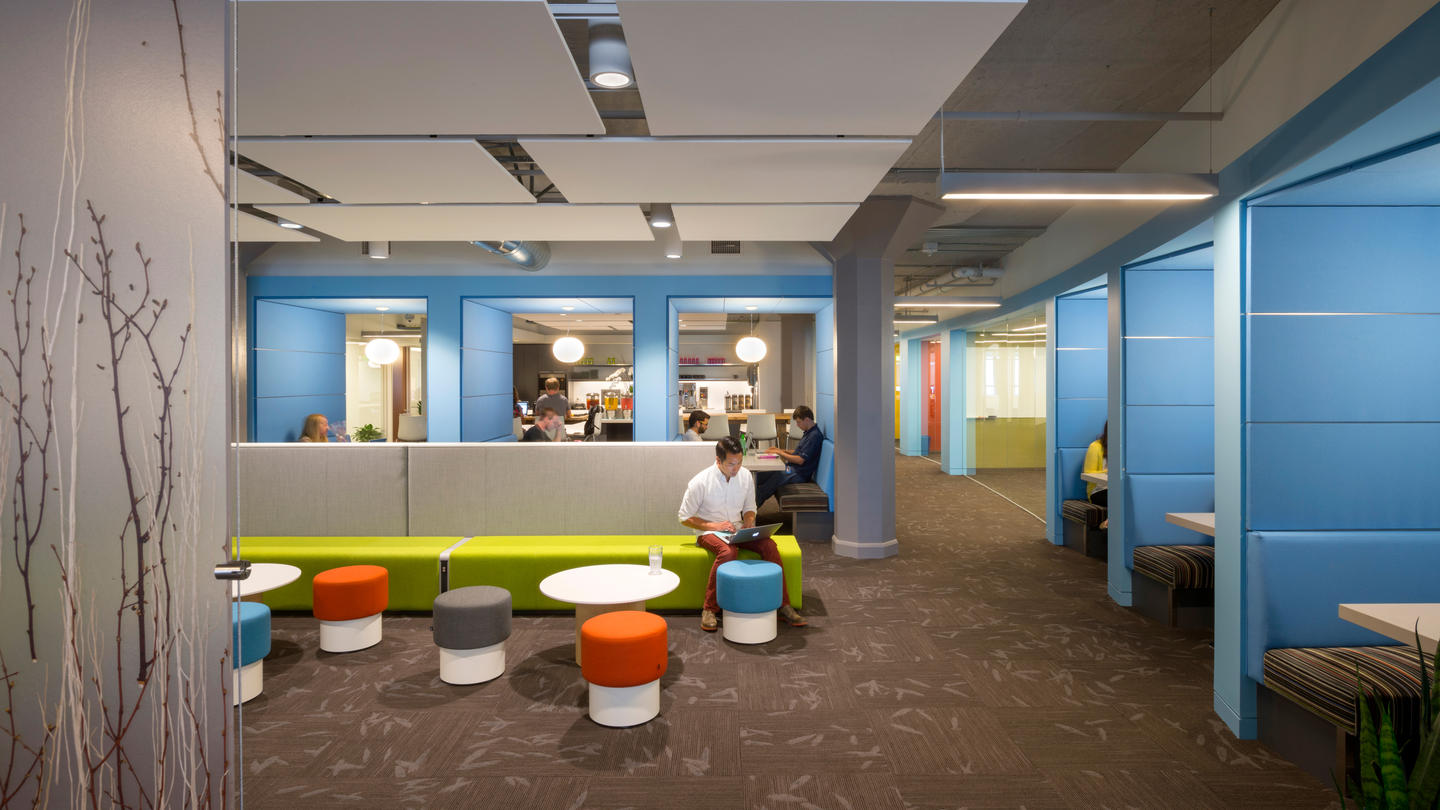
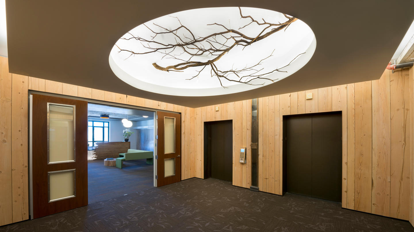
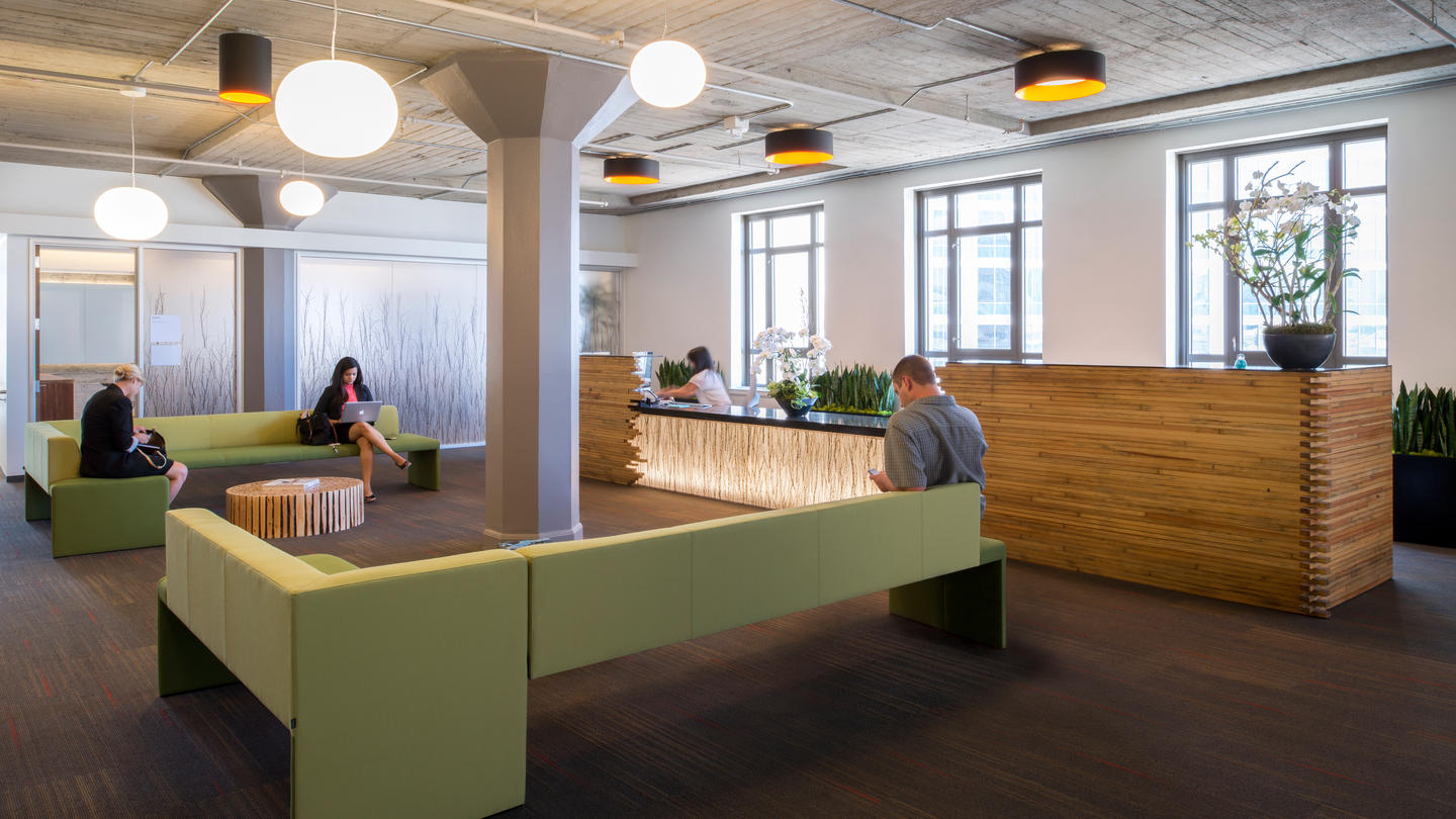
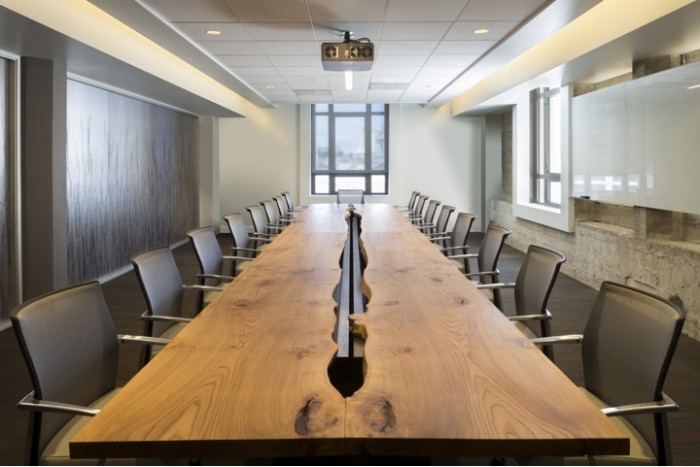
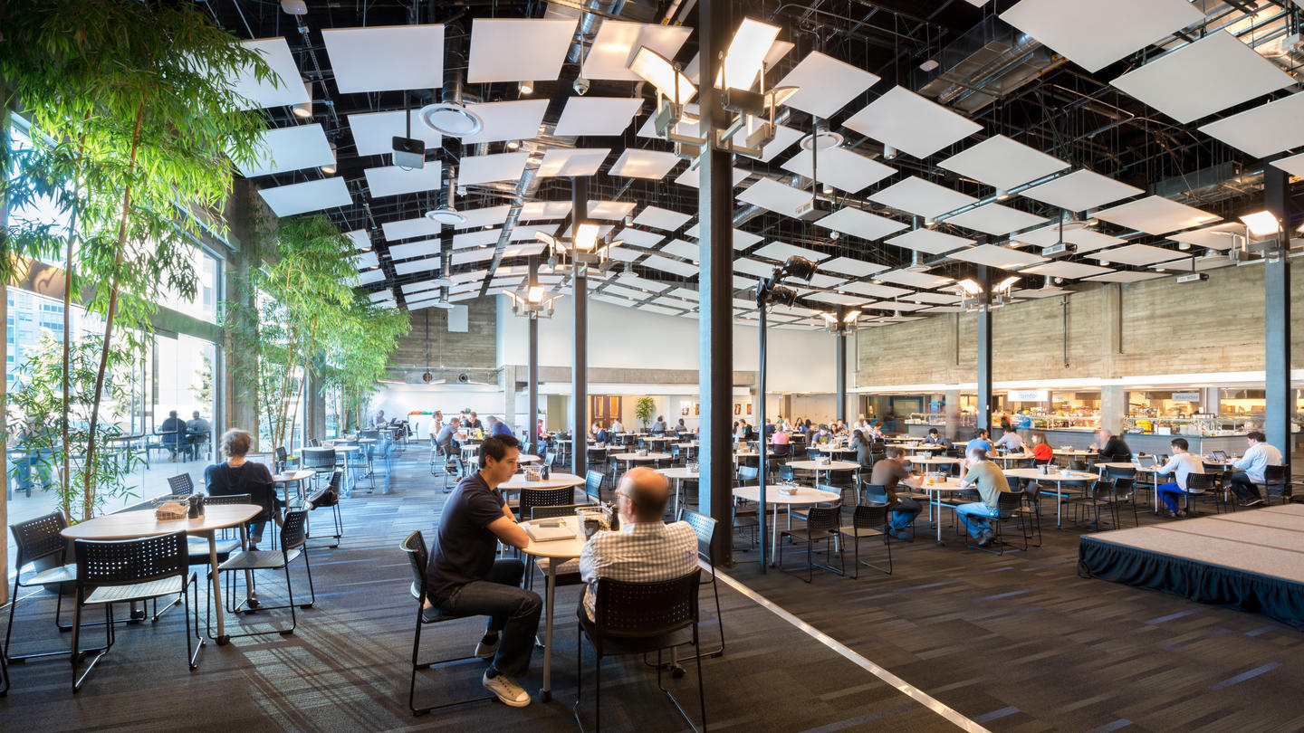
Like most tech companies these days, Twitter has gone away from the hyper-contemporary, white and chrome motif of the early Apple stores. Instead they've embraced the more natural and earthy feel of their avian logo; large, open expanses peppered with conference rooms, cooperative work spaces, lounge areas, and kitchen/dining areas, and a wide open roof terrace, all carefully branded with the Twitter blue, pops of green, plenty of wood and a repeated twig motif. Their main cafeteria is even known as 'the Perch!' By modernizing a typically 'outdoorsy' feel, the designers, IA Interior Architects, in collaboration with Lundberg Design, have successfully created a space that reflects Twitter's creative culture.


Spotify
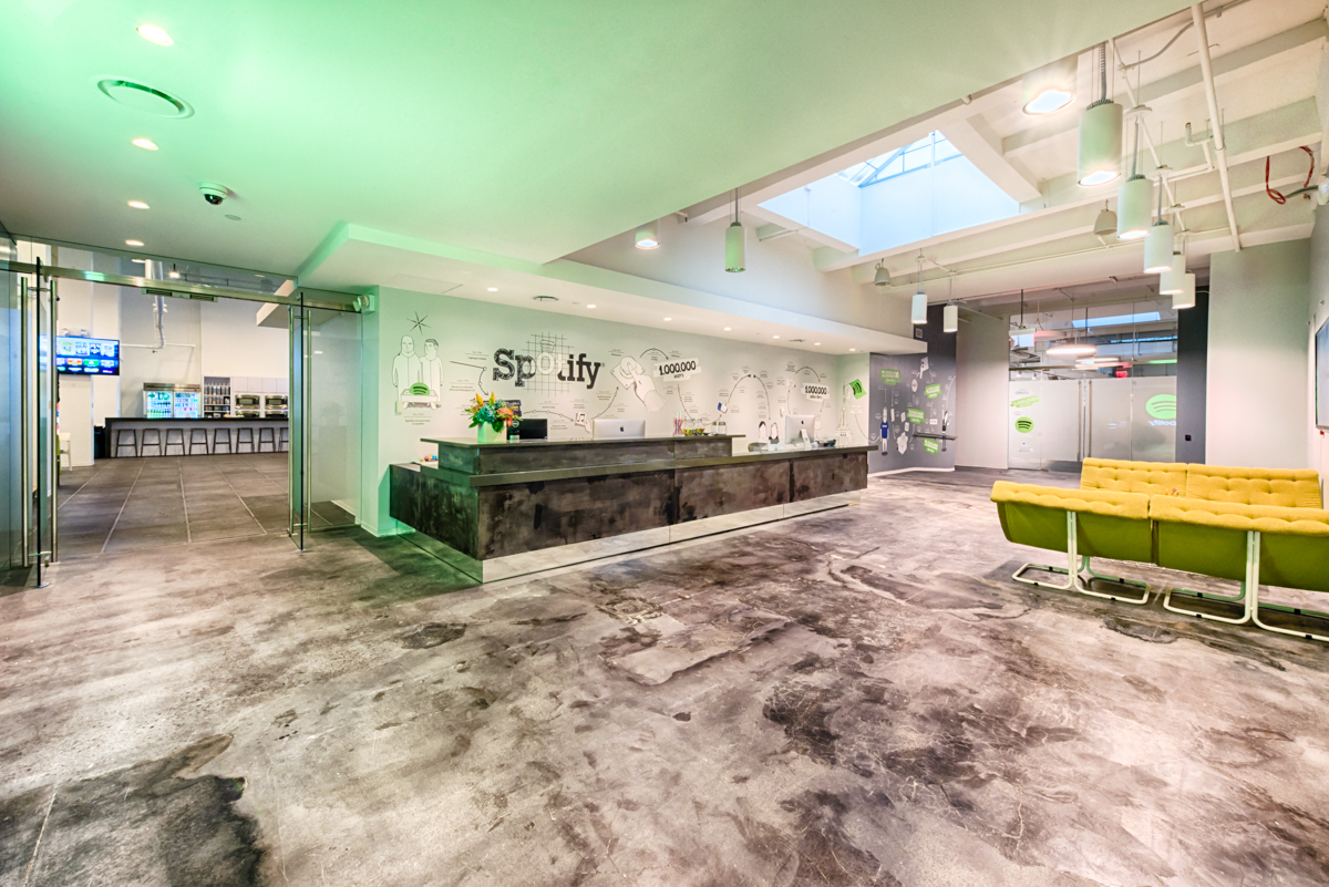
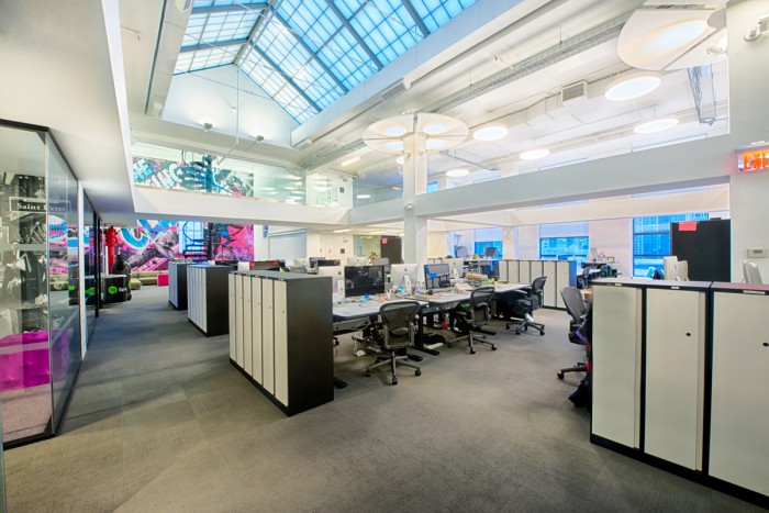
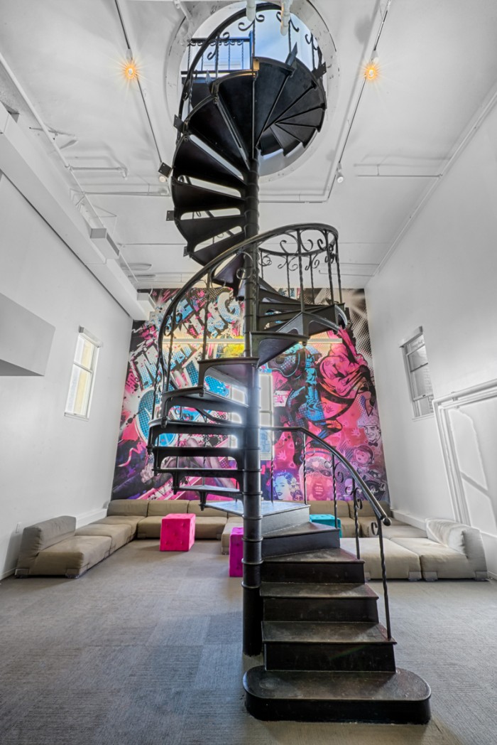
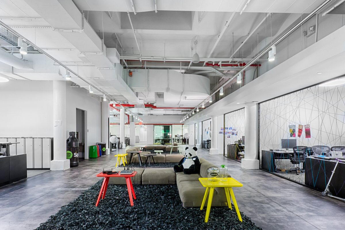
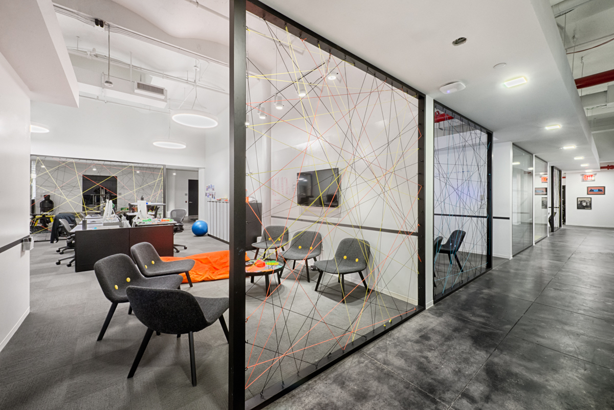
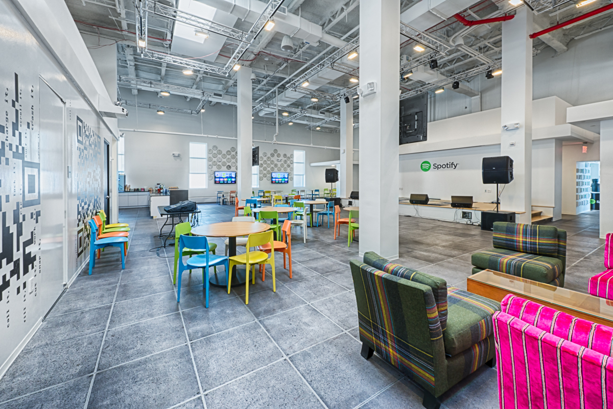
Spotify's Headquarters in New York City is a shining example of what a dedicated and driven person can do in design, without having been formally trained. The entire office was designed in-house by Spotify's very own employees. Custom artwork abound in the building (most are musically influenced, for good reason) and splashes of color are hard to miss, whether on the walls or on the furniture. A large open main work space is flooded with natural light from skylights above, and smaller co-op rooms dot the office to get people moving around. Speaking of moving around, this is the largest installation of Airtouch height-adjustable tables in the entire state (397 of them, to be exact). Partial walls made of metal frames and filled in with colored string do a great job of creating a sense of privacy, but also making sure everyone is available if needed. While they were at it, the employee-designers included a performance stage in their open dining area. Because when you're a music streaming company, you play music!
Bonus! 3 Cool Re-purposed Buildings For New Offices!
TBWA/Hakuhodo
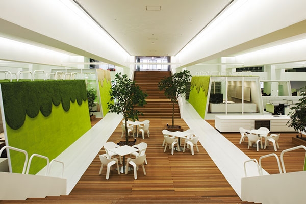
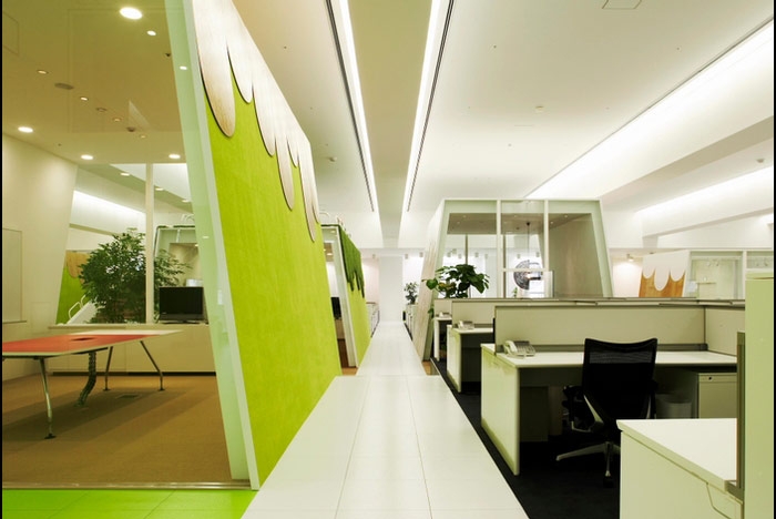
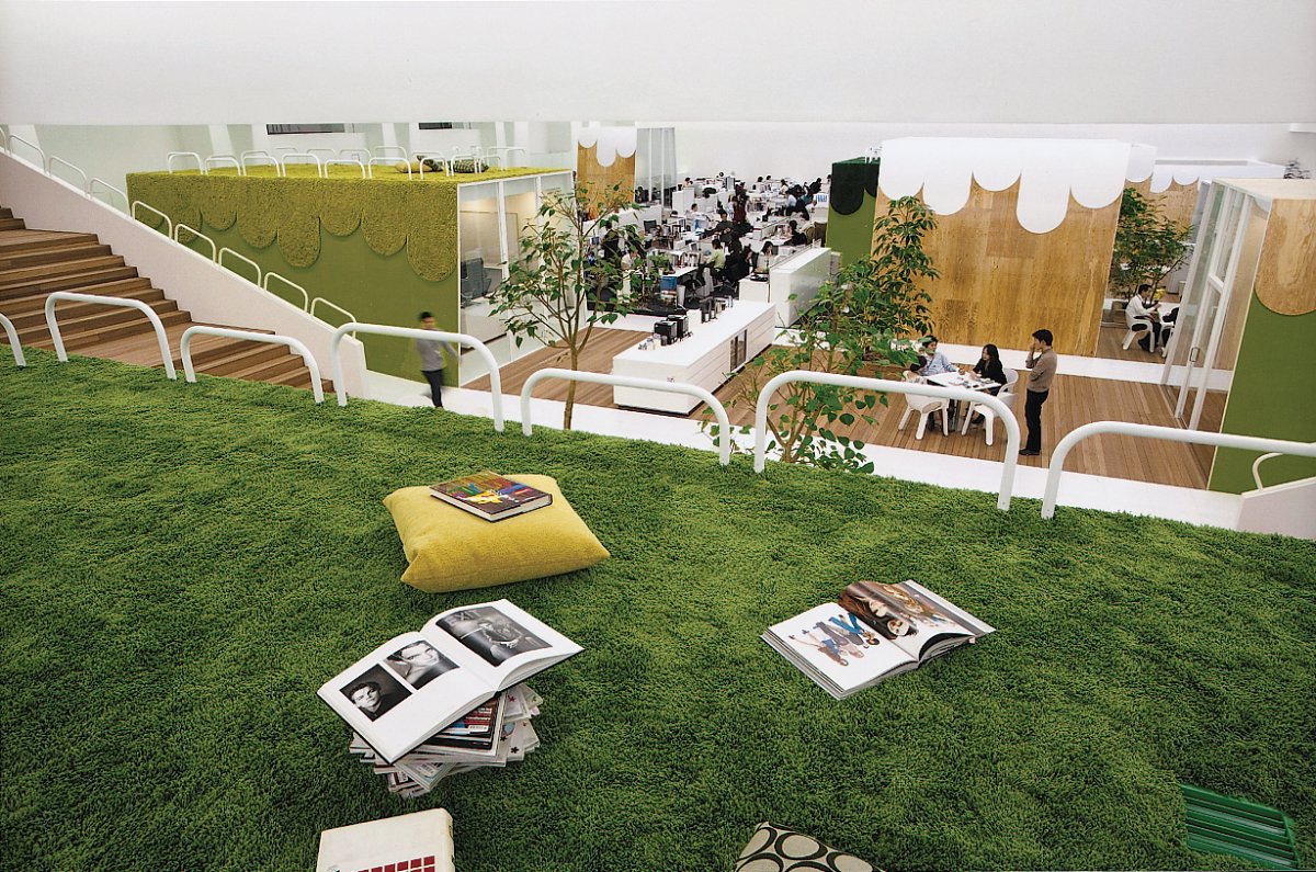
Two of Japan's leading advertising agencies teamed up for new offices in Tokyo and took over what used to be a bowling alley in a large eight-story amusement complex. The large open space made for a completely open floor plan of work space, separated only by grassy 'hills' that rise from the floor and house cooperative work space and other offices. You can even congregate on top of the 'hills' for a little break from work!
Dogpatch Labs
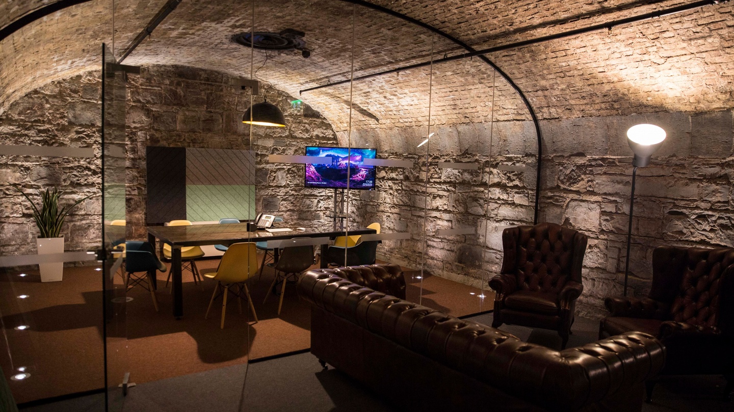
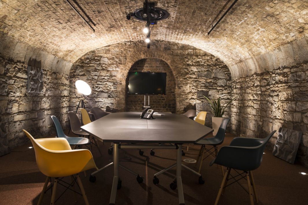
A co-working, tech-centric office for tech start-ups, Dogpatch Labs has built a new space in the docklands of Dublin for anyone in need of an office. The best part? They've expanded to the cellar. You can work in an old wine vault!
Ricardo Bofill
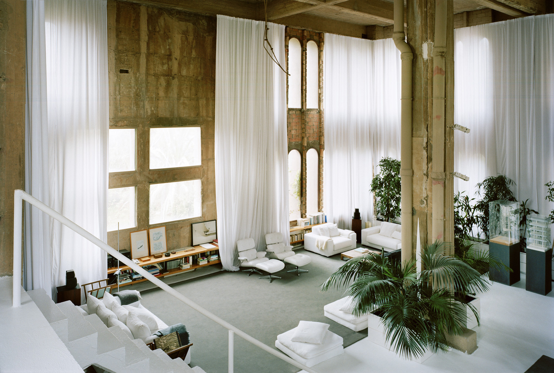
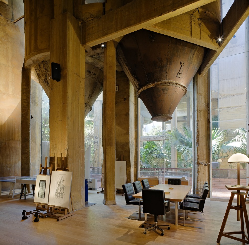
Architect Ricardo Bofill took an abandoned cement factory in Spain and turned it into a surreal work of workplace art. The existing cement silos became offices, libraries, various meeting spaces, etc. A large machinery room, now known as 'the Cathedral,' is used for concerts and exhibitions. It's a true testament to creativity in design.




Plants That Will Clean Your Home! (The Air, That Is)
We live in dirty homes and apartments, and work in dirty office buildings. It's a fact. Yes, you probably just vacuumed and dusted, or the janitor came and emptied the office trash can, but I'm not talking about your floors or desk tops or kitchens. Your air is dirty.
Very dirty, actually. I'm talking specifically about VOCs, or Volatile Organic Compounds, that are present at almost every stage of construction and well past; flooring (finishing on wood or tile and carpet), wall coverings (paint, especially), furniture (chemicals in staining or dyeing and conditioning), even electronics (printers, copy machines). You know that 'new car smell' that everyone loves? Yeah, that's a VOC.
Studies have shown that we spend around 90% of our time indoors. Thats 90% of all of our time, every day. And because of these VOCs, the air we breathe indoors can be almost 10 times more dangerous than anything outdoors. That's where the plants come in. A recent study by Ballieux Organic Architects and Nieuwkoop Eurpoe used NASA-approved equipment to measure the molecular composition of air in two school classrooms, one with plants and one without (for best results, one 12in. potted plant for every 100sqft). It was proven that the classroom with plants had 50% less Volatile Organic Compounds. Better air quality, less illness, and less allergy related symptoms. That's along with other proven benefits of having plants around, including increased happiness, improved sleep, sharper focus and improved memory retention, and better quality work output.
So in an effort to get you breathing easy, here are the best plants for scrubbing your dirty air.
Palms
Bamboo Palm
Easy to care for, thrives in low light, and tolerates hot and cold air temperature changes (conditioned air indoors). Grows up to 6ft. high, so make sure you have space for it.
Removes; formaldehyde
Areca Palm
Another easy-to-care-for indoor-tolerant plant, great for increasing humidity and highest ranking plant for removal of toxins from the air. Also grows up to 6ft. high. Needs bright direct light.
Removes; carbon monoxide, formaldehyde, benzyne (a carcinogen, or cancer-causing agent)
Dwarf Date Palm
Another excellent scrubber, and great for low light areas. Can grow up to 10ft. tall, so keep an eye on growth and maybe move it outside when it reaches maturity.
Removes; formaldehyde, xylene (chemical found in plastics and solvents)
Ferns
Boston fern
Best in bright lights and moist soil (regular watering), but is a natural humidifier and another 'best' and air purifying.
Removes; formaldehyde, benzene, trichloroethylene (chemical used in solvents and cleaning agents)
Kimberly Queen Fern
Needs bright (but indirect) light and best with regular watering while letting the soil dry out a bit between waterings.
Removes; formaldehyde, xylene, toluene (chemical used in common glues and thinners)
Flowering Plants
peace lily
Best in bright, indirect light and loves lots and lots of water. Good for cleaning the air of course, but also known to remove spores and molds from the air. Would be great for kitchens and bathrooms.
Removes; benzene, trichloroethylene, alcohols and acetone, formaldehyde
mums
Best in partial light and a lot of water, but they are generally annuals, maybe not best year round.
Removes; benzene, trichloroethylene, formaldehyde, ammonia
moth orchid
Thrives in relatively high humidity and heavy waterings with near-complete drying of soil in between.
Removes; formaldehyde
Hopefully you can use this post as a guide to get some much needed greenery in your home or work place. Do it for your health!
4 DIY Projects for a Glam Master Bedroom on a Budget
Aside from the living rooms and kitchens, we spend quite a bit of time in our bedrooms. Not just for sleeping, but for getting dressed and ready for the day, making phone calls, reading, or even getting a jump start on cleaning out the DVR. Since we spend so much time in there, why not make it as pleasant of an experience as possible? Here are just a few ideas that can help spruce up the 'place where the magic happens' for pennies on the dollar.
Creative Covers for your TV
You can find numerous pro/con listicles for why you should or shouldn't have TV's in your bedroom. If you don't, Great! If you do, that's awesome, too! BUT, if you do have a TV in there, let's dress it up a bit. Covering your TV with simple medicine-style cabinet doors, or a sliding barn door, will help hide away anything unsightly. Even a simple picture frame mounted to the wall around the TV is a great way to keep the attention off the TV itself and incorporate it in a gallery wall with other art.
Put up a Canopy
It's easy to blow a few thousand dollars on a fancy canopy bed; it's such an upscale look that no one thinks twice about the cost. Maybe you should, though. It's way easier to make one yourself! You can find some simple curtain rods to create the same look and feel, or even use PVC pipe and various fittings (mixed with a bit of spray paint) for a simple Sunday project. You don't even have to go around the entire bed, the corners work just fine as well!
Paint, Paint, Paint!
Now is not the time to be boring with your paint choices; no more Taupe on Taupe. Now is the time to be bold! Don't shy away from some drastic color improvements.
Having said that, walls are very 'been there, done that.' Don't be afraid to get up on your ladder and pull a Michelangelo, because accent walls are out and accent ceilings are definitely in. But If you're not quite ready for a painted ceiling, consider painting accent colors on half walls all the way around your room rather than a full wall. It will bring a lot of drama to the room, while giving it the appearance of being taller than it actually is. If you're feeling really daring, you can always combine the two as well!
Molding/Paneling/Planking
Nothing says 'classy' more than intricate molding in a room, whether it's at the ceiling, on the walls, or at the floor. If you want to really make your room pop, these are easy additions you can do in a weekend.
If you're not savy, look to this foam option for an easy crown molding install (you could even wrap molding around your new canopy!). Looks as good as the real stuff, but can be done without all the tools. If you have existing baseboards, you can add some extra height with some paint and a simple half-round from your local hardware store. It's an easy way to bump up the 'wow this place looks expensive' factor.
Sure, you could just paint the walls, but it's way more fun to nail some wood to the walls first! Pallet wood, peel & stick vinyl flooring (seriously, picture #2 is peel & stick flooring!), or even a healthy dose of shiplap and a coat of paint are all great options to mix different textures along with new and fresh colors in your space.
Hopefully you can use one of these ideas, or even combine a few tips, for a new and improved bedroom space. Good luck!
Pictures and links courtesy of Sawdust 2 Stitches, One Kings Lane, Amazon, Shanty 2 Chic, Our Pinteresting Family, and Muskoka Living.
"How To;" Soundproof your Space
There are plenty of reasons to soundproof a room (or several rooms) in your home. Maybe you have a home theater and you'd rather not wake up the kiddos. Or maybe those kiddos get in the habit of making a ton of noise and you'd rather work out of your home office in relative peace. Now technically speaking, it's really, really, REALLY hard to make a room completely soundPROOF. I like to think of these tips as a way to make your room sound RESISTANT (but for the sake of this post, we'll stick to saying soundproof). In any case, here's just a few of the many possible "How To" tidbits to taking those decibels from "rock concert" down to "crickets."
Do you remember moving in to your first apartment or home? Every room is empty and sounds SO loud. But once you start filling it up the rooms shrink up and the house stops echoing. Once you add the sofa, rugs, and curtains, the sound starts to go away. These "sound buffers" are the easiest and most cost-effective add-on fix to the loud spaces; pillows, canvased art work stuffed with egg-crate foam, tapestries, etc. If you can add more of these items to your loud spaces, they will do their part in keeping sound from bouncing out.
It seems simple, but adding a few soft goods can not only bring a room to life, but soften the sounds all around.
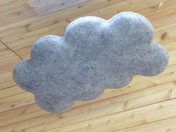
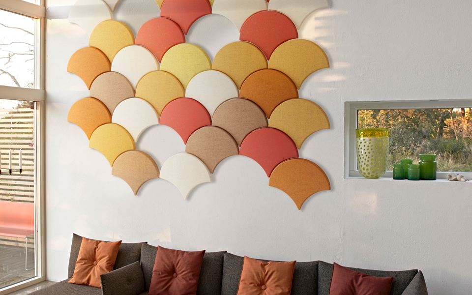
If a few pillows and throw blankets aren't cutting it, you can take the next step into soundproofing by adding paneling made specifically for acoustic control. There's the DIY hardware store foam panel wrapped in decorative fabric, which is by far the most economical choice. There's also these hanging clouds (available in other shapes as well)that have a really neat look (maybe for a whimsical nursery?), starting at around $200/piece. Lastly, custom shaped and colored acoustic panels that have the benefit of extra insulation, as well as help with the sound absorption (contact for pricing).
If you have the resources you can start 'proofing your rooms before you ever have an issue. This option would be your most costly, as it starts at the planning phase of construction. First, pick out the rooms that need the most protection, like a nursery or bedroom. Rather than building your walls in the traditional sense (see figure below, top diagram; drywall from neighboring spaces attached directly to the studs) you would instead give the insulation inside the wall a little breathing room and ensure studs from one room don't touch the drywall from the neighboring room (bottom diagram), thus stopping sound transfer (which is just vibrations) dead in its tracks.
Although it adds more thickness to your walls, the gaps in studs will stop vibrations from migrating to other rooms. This doesn't need to be done to every room, but even four walls around your loudest spaces will make a huge difference.
Hopefully these few tips will get you on the right track to some much deserved peace and quiet!
Products and pictures thanks to Oak Ridge Revival, DIY Masterz, Wooly Shepherd, BAUX, and Bla Station.
3 'Rustic' Home Features to Add Value and Subtract Time On Market
There are additions and features that everyone thinks of when they think about adding value to their home (granite or quartz counter tops, stainless steel appliances, subway tile, and hardwood floors come to mind), but there are also a few that are pretty unexpected. Zillow Digs recently did a study of the most sought-after features in homes being sold today by researching home listings and the keywords they use, and although you may feel like the 'rough-around-the-edges' looks may be fading fast, they couldn't be hotter. Below are 3 unexpected 'rustic' looks and features (and inspiration pictures) that will give your home that little nudge to the top of someone's list.
Craftsman Details
Zillow looked at 60 key words and found that listings that described homes as being 'craftsman' sold better than any other single style, selling 14 days faster than your ranch or tudor homes.
Shaker Cabinets
Of the key words analyzed, shaker cabinets not only helped homes sell 45 days faster and for almost 10% more than their expected values, but according to Dr. Svenja Gudell, Zillow's chief economist, the good-ol plain fronts also hint to potential buyers at other uber-desirable features.
Barn Doors
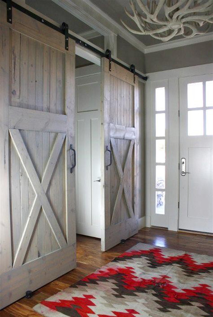
This one was a shocker to me. One of the easiest additions you could make to most spaces actually has the greatest effect on home value and time spent on the market. Homes that featured a barn door went off the market 57 days faster than homes without them, and helped those same homes sell an average of 13.4% over their expected values. Who knew a door you could pick up at Lowe's and install in a short weekend would get quite that bang for your buck!?
The Brewery is Open!
A few months ago I had the opportunity to help a soon-to-be-opening brewery design their tasting room, and after months of licenses applied for, paperwork sent in, inspections upon inspections, Arches Brewing is now open for business! I guess a bit of a backstory is needed for those of you living in states (or countries, since this is the internet) that don't have these laws; if you make your own beer you can open up a physical location to show off your beer. Now you can't actually sell your own beer thanks to distribution laws, so you have to sell 'tours' of your facility where you can pour smaller amounts for your patrons to sample. Long story short, they needed some design help, and they pay in beer (joking, kind of), so I said yes!



Their brewing philosophy follows the German brewing schedule. In layman's terms, their brewing schedule follows the weather, with their different beers finishing and ready for drinking to go with the changing seasons. With the German taste driving their beers forward, they wanted a simple and clean tasting room that would still invoke the feeling of a traditional German beer hall.
We're really close to that beer hall feel. It's a tall, open space with light earthy tones to help bring the outdoors in. Sound deadening material was used on the ceiling to keep the room from becoming an echo chamber during the sure-to-be-busy tasting days. We chose black to keep the room from feeling too bright, and to help frame the space out a bit. Reclaimed wood from an old cotton mill is used extensively to help reinforce the targeted old-world feel, and to mimic their old-world beers. I think over the next year or so it will have all the finishing touches it needs.
There are a TON of ideas I threw at them to help bring the European flair; some stuck, some didn't. Some will come in later, some may never. The important thing is that the brewers are ecstatic with their growing and evolving tasting room. You can see the beginnings of the process, as well as preliminary renderings on the website under "Current Projects." Just know that there were many emails, texts, visits, etc. to get the look to where it is from where it was. I'm just glad I finally get to drink their beer!
"How To;" Get the Tiny-House Feel
The Tiny House revolution has officially started. There are a myriad of reasons to make the switch to smaller square footage, and there have been studies to prove it. Versus normal-sized home owners, tiny-home owners on average have a higher yearly income, more money in the bank, less (or even no) credit card debt, and have no mortgage to pay off. All really great incentives to tiny-home ownership, right?
Buuuuut tiny-home living isn't for everyone. For every good statistic, there's a less desirable one. The biggest (haha, get it?) of these stats is obviously the smaller footprint and less square footage. The average home built today is over 2,100 square feet, while tiny homes today average only 186 square feet! So in today's "How To," we're going to look at a few ways you can attain the minimalist look and feel of the tiny home movement without getting rid of a vast majority of your precious, precious stuff.
First thing I would recommend is getting furniture that serves multiple purposes. I've always been a fan of cocktail ottomans, a hybrid between the ottoman and a cocktail table. Extra points if it's hollow and serves as storage. This solution can potentially get rid of that extra chair you have laying around and will also help clean up extra clutter you have laying around, such as magazines, books, and blankets. One large or medium sized depending on the size of your space can work. Or get multiple smaller ones for super versatile seating.
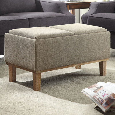
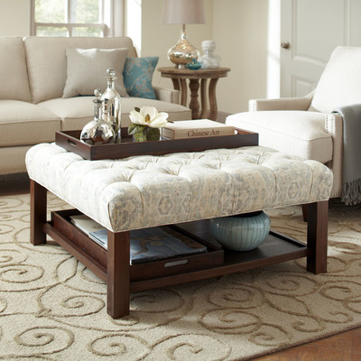
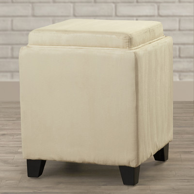
Above; ottomans thanks to Wayfair, here, here, and here.
Built-in banquette seating can be a really neat addition as well. If you keep the bottoms open and accessible. all of that extra space can be used for the big pots and pans you have in the kitchen, or larger hardly-used appliances that don't need to be taking up space on your counter tops.
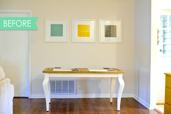
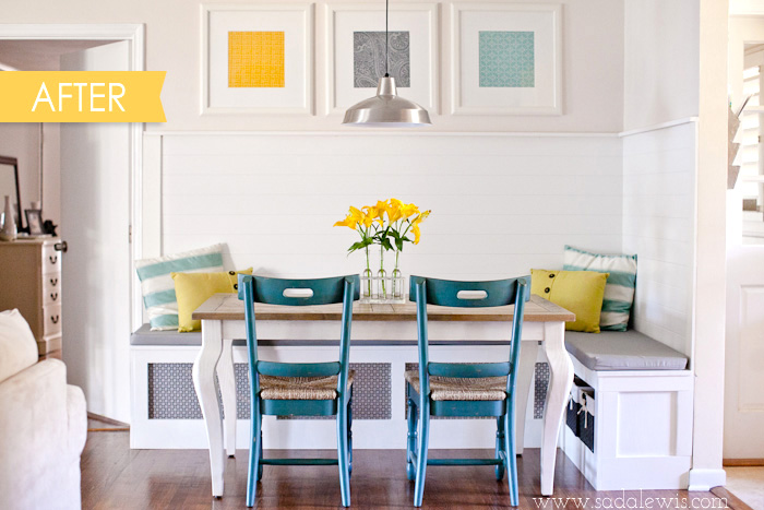
Above; banquette before and after thanks to Casa de Lewis.
Second recommendation is to utilize any and all 'extra' vertical spaces. Take a look at your main living space right now (family room, living room, whatever you want to call it). I can guarantee you've got at least one, maybe even two, empty and bare walls that are perfect for free floating shelves or a built-in shelving unit. I can think of three in my room right now! Shelves and built-ins can give you the opportunity to remove a few end tables and free up some major floor space to keep usable square footage to a maximum.
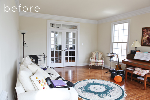
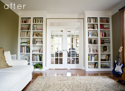
Above; before and after pictures thanks to Design Sponge.
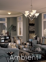
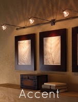
Third suggestion is all about lighting. Lighting can have a very drastic impact on the perceived space in your room. The darker the room, the smaller it will feel, and vice versa. now having said that, I wouldn't go buying a small army of table lamps to put everywhere. Having more light is important, but it's all about the type of light you have. You'll need a happy mixture of down lighting, or "task" lighting, diffused ambient lighting, and accent lighting. Task lighting will help illuminate smaller areas for reading, writing, etc. The ambient lighting will keep a nice uniform light throughout the entire space. Think recessed can lighting or even a few floor or table lamps with light shades to allow the light to diffuse evenly throughout the space. And finally the accent lighting will help highlight spaces you want your eye to hover, like those new built-ins and shelves, or special artwork.
Above; lighting examples thanks to the American Lighting Association.
Hopefully these little ideas and suggestions can help you clean up your space a bit and get that nice, uncluttered, and clean tiny-home look and feel. Thanks again!
Header image courtesy of POPSUGAR. Study thanks to the Tiny Life.
"How To;" Stage Your Flat Surfaces
Hey again! Welcome to my first installment of my own little "How To" series. Every so often I'll be giving you tips and tricks you can use in your own spaces to achieve a true designer-like look and feel. First up; how to make your flat surfaces like tables, counters, desks, etc. pop and come alive.
Unless everything in your home is white and chrome and sterile like a hospital, the worst thing you could probably do is have blank surfaces. I don't trust anyone with an empty cocktail table (what are you trying to hide, huh!?), plus having knickknacks on these surfaces helps your space feel warm, inviting, and most of all, lived in. So rule number one, put something on that table!
Rule number two? We want... stuff on that table, just not too much stuff. There's a finer line than you think between just enough and too much, so walk it carefully. Typically, the smaller the surface and space, the smaller and fewer your items should be. The larger the surface, the more pieces you can have and the larger they can be. Scale is VERY important when it comes to this stuff.
Rule number three; keep it odd. Clusters of an odd number of items is going to be key in creating the visual interest you need on the surface. Even numbers are too symmetrical and can be paired up too easily by your mind. Odd numbers will force your eye to dance through the space and spend time at a particular point, rather than immediately moving on. Next time you open up a home design magazine, take a look at tables in the ads and pictures in the articles, I bet you'll notice the odd numbers. You'll probably also notice rule three a) and b)...
Three a) is to have items of varying height, and b) is varying size/shape. If we have odd numbers to create visual tension and force our eyes to linger, we incorporate items of varying size and height to create visual balance in the composition at the same time. If we can successfully create tension and 'solve' that same tension in the same breath, we've created something truly dynamic and worth looking at.
So crack open that old box of books, candle holders, and other little tchotchkes, and get to work!
Is Interior Design 'Art?'
Hey again! So I just got back from a trip to Paris, France over the weekend. If there's a better city to take in art, you'll have to clue me in. I mean, the Louvre is there, people! Three days spent walking through a city where there's more art history than your country has, well, history, puts things in perspective.
The Venus de Milo. They say she's a size 12-14 today. #realmarblehascurves
After two days of stained glass and relief carvings at Notre Dame and headless/armless marble statues at the Louvre, I was (dare I say) almost full of the art scene. Then on the third day we crossed the Seine river to the Musee d' Orsay. For the most part it was very similar to the Louvre; old paintings, old marble statues missing random body parts, etc. Now don't get me wrong, the Louvre is absolutely amazing; I could get lost in there (quite literally). But the Orsay wasn't an old castle liberated from an old king by the people. Nothing quite as 'regal' but still born out of a history of blood and just as interesting for its own reasons.
The Orsay Museum. Only 4 floors of art, but probably room for at least 4 more. I'm glad they kept the space open to the natural light and exposed the feel that the train station used to have.
The Orsay Museum was Paris' main train station, bombed to almost nothingness in WWII. It was slated for tear down after some renovations, but was instead turned into a museum to bridge the gap between the Louvre and the Museum of Modern Art. I for one am very glad they saved it.
Because of the different surroundings I think it opened my eyes to not only the art on the walls, but also to the walls that the art was hanging on. It made me pay attention to how the rooms were separated, how your eye danced across the entire atrium, how you could look at details so small, then step back and see the bigger picture. It was the first museum that forced me to see this new aspect.
Then I found it. The room I didn't know I had been waiting for. Not a room of wood-framed paintings, but a room full of wood none the less. I'm talking furniture! Furniture as art! Furniture just as fine and curvaceous as Venus de Milo herself! It was very exciting to see (what most people would call) humble desks and chairs and bed frames sharing space with Van Gogh and Degas and Gauguin. The French (with the help of an Italian Architect) had quite successfully turned interior design into art simply by housing it AND creating an eye opening space to show it to the masses.
Special appearance by m'lady.
I may not be opening any eyes with this post, but I can say unequivocally that yes, interior design is indeed a fine art. It's not just about the pretty things on the wall. Sometimes it's about the walls themselves.
Thanks for visiting!


