DIY

"How To;" Soundproof your Space

There are plenty of reasons to soundproof a room (or several rooms) in your home. Maybe you have a home theater and you'd rather not wake up the kiddos. Or maybe those kiddos get in the habit of making a ton of noise and you'd rather work out of your home office in relative peace. Now technically speaking, it's really, really, REALLY hard to make a room completely soundPROOF. I like to think of these tips as a way to make your room sound RESISTANT (but for the sake of this post, we'll stick to saying soundproof). In any case, here's just a few of the many possible "How To" tidbits to taking those decibels from "rock concert" down to "crickets."


Do you remember moving in to your first apartment or home? Every room is empty and sounds SO loud. But once you start filling it up the rooms shrink up and the house stops echoing. Once you add the sofa, rugs, and curtains, the sound starts to go away. These "sound buffers" are the easiest and most cost-effective add-on fix to the loud spaces; pillows, canvased art work stuffed with egg-crate foam, tapestries, etc. If you can add more of these items to your loud spaces, they will do their part in keeping sound from bouncing out.

It seems simple, but adding a few soft goods can not only bring a room to life, but soften the sounds all around.

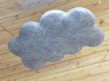
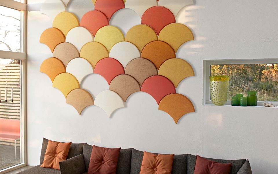
If a few pillows and throw blankets aren't cutting it, you can take the next step into soundproofing by adding paneling made specifically for acoustic control. There's the DIY hardware store foam panel wrapped in decorative fabric, which is by far the most economical choice. There's also these hanging clouds (available in other shapes as well)that have a really neat look (maybe for a whimsical nursery?), starting at around $200/piece. Lastly, custom shaped and colored acoustic panels that have the benefit of extra insulation, as well as help with the sound absorption (contact for pricing).

If you have the resources you can start 'proofing your rooms before you ever have an issue. This option would be your most costly, as it starts at the planning phase of construction. First, pick out the rooms that need the most protection, like a nursery or bedroom. Rather than building your walls in the traditional sense (see figure below, top diagram; drywall from neighboring spaces attached directly to the studs) you would instead give the insulation inside the wall a little breathing room and ensure studs from one room don't touch the drywall from the neighboring room (bottom diagram), thus stopping sound transfer (which is just vibrations) dead in its tracks.

Although it adds more thickness to your walls, the gaps in studs will stop vibrations from migrating to other rooms. This doesn't need to be done to every room, but even four walls around your loudest spaces will make a huge difference.

Hopefully these few tips will get you on the right track to some much deserved peace and quiet!

Products and pictures thanks to Oak Ridge Revival, DIY Masterz, Wooly Shepherd, BAUX, and Bla Station.

3 'Rustic' Home Features to Add Value and Subtract Time On Market

There are additions and features that everyone thinks of when they think about adding value to their home (granite or quartz counter tops, stainless steel appliances, subway tile, and hardwood floors come to mind), but there are also a few that are pretty unexpected. Zillow Digs recently did a study of the most sought-after features in homes being sold today by researching home listings and the keywords they use, and although you may feel like the 'rough-around-the-edges' looks may be fading fast, they couldn't be hotter. Below are 3 unexpected 'rustic' looks and features (and inspiration pictures) that will give your home that little nudge to the top of someone's list.


Craftsman Details

Zillow looked at 60 key words and found that listings that described homes as being 'craftsman' sold better than any other single style, selling 14 days faster than your ranch or tudor homes.


Shaker Cabinets

Of the key words analyzed, shaker cabinets not only helped homes sell 45 days faster and for almost 10% more than their expected values, but according to Dr. Svenja Gudell, Zillow's chief economist, the good-ol plain fronts also hint to potential buyers at other uber-desirable features.


Barn Doors

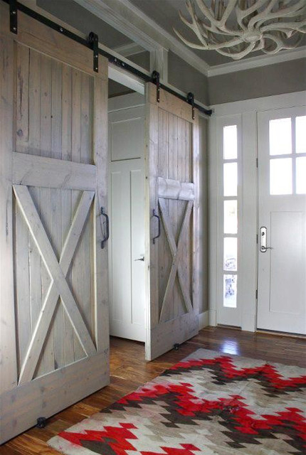
This one was a shocker to me. One of the easiest additions you could make to most spaces actually has the greatest effect on home value and time spent on the market. Homes that featured a barn door went off the market 57 days faster than homes without them, and helped those same homes sell an average of 13.4% over their expected values. Who knew a door you could pick up at Lowe's and install in a short weekend would get quite that bang for your buck!?

All photos courtesy of Houzz, Pinterest, and Etsy.

"How To;" Get the Tiny-House Feel

The Tiny House revolution has officially started. There are a myriad of reasons to make the switch to smaller square footage, and there have been studies to prove it. Versus normal-sized home owners, tiny-home owners on average have a higher yearly income, more money in the bank, less (or even no) credit card debt, and have no mortgage to pay off. All really great incentives to tiny-home ownership, right?

Buuuuut tiny-home living isn't for everyone. For every good statistic, there's a less desirable one. The biggest (haha, get it?) of these stats is obviously the smaller footprint and less square footage. The average home built today is over 2,100 square feet, while tiny homes today average only 186 square feet! So in today's "How To," we're going to look at a few ways you can attain the minimalist look and feel of the tiny home movement without getting rid of a vast majority of your precious, precious stuff.

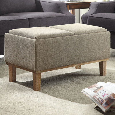
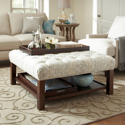
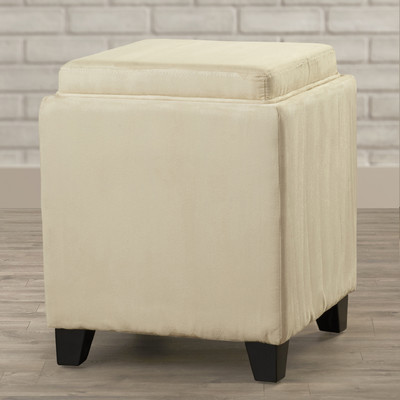
First thing I would recommend is getting furniture that serves multiple purposes. I've always been a fan of cocktail ottomans, a hybrid between the ottoman and a cocktail table. Extra points if it's hollow and serves as storage. This solution can potentially get rid of that extra chair you have laying around and will also help clean up extra clutter you have laying around, such as magazines, books, and blankets. One large or medium sized depending on the size of your space can work. Or get multiple smaller ones for super versatile seating.

Above; ottomans thanks to Wayfair, here, here, and here.

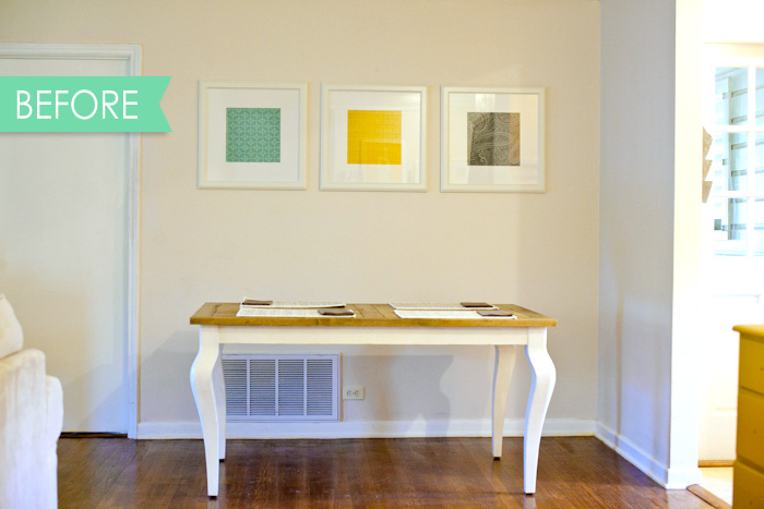
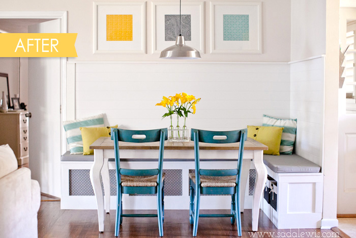
Built-in banquette seating can be a really neat addition as well. If you keep the bottoms open and accessible. all of that extra space can be used for the big pots and pans you have in the kitchen, or larger hardly-used appliances that don't need to be taking up space on your counter tops. 

Above; banquette before and after thanks to Casa de Lewis.

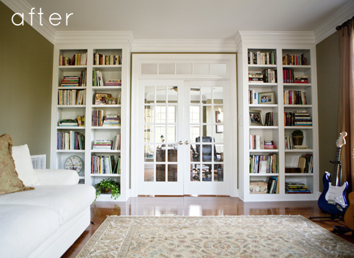
Second recommendation is to utilize any and all 'extra' vertical spaces. Take a look at your main living space right now (family room, living room, whatever you want to call it). I can guarantee you've got at least one, maybe even two, empty and bare walls that are perfect for free floating shelves or a built-in shelving unit. I can think of three in my room right now! Shelves and built-ins can give you the opportunity to remove a few end tables and free up some major floor space to keep usable square footage to a maximum. 

Above; before and after pictures thanks to Design Sponge.

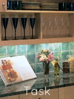
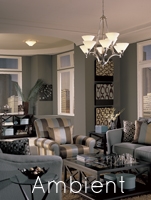
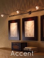
Third suggestion is all about lighting. Lighting can have a very drastic impact on the perceived space in your room. The darker the room, the smaller it will feel, and vice versa. now having said that, I wouldn't go buying a small army of table lamps to put everywhere. Having more light is important, but it's all about the type of light you have. You'll need a happy mixture of down lighting, or "task" lighting, diffused ambient lighting, and accent lighting. Task lighting will help illuminate smaller areas for reading, writing, etc. The ambient lighting will keep a nice uniform light throughout the entire space. Think recessed can lighting or even a few floor or table lamps with light shades to allow the light to diffuse evenly throughout the space. And finally the accent lighting will help highlight spaces you want your eye to hover, like those new built-ins and shelves, or special artwork.

Above; lighting examples thanks to the American Lighting Association.
Hopefully these little ideas and suggestions can help you clean up your space a bit and get that nice, uncluttered, and clean tiny-home look and feel. Thanks again!

Header image courtesy of POPSUGAR. Study thanks to the Tiny Life.