During the design phase of the office I'm wrapping up, I did quite a bit of research into office spaces. I don't work in a traditional 'office' (and I couldn't be happier about that, by the way) so this research was invaluable when it came to creating a space that made people enjoy coming into work, but also made them more productive while working. Below are five of my favorite office spaces that I came across, with a little description about the space and insight into the design. Enjoy the office envy!
Onefootball
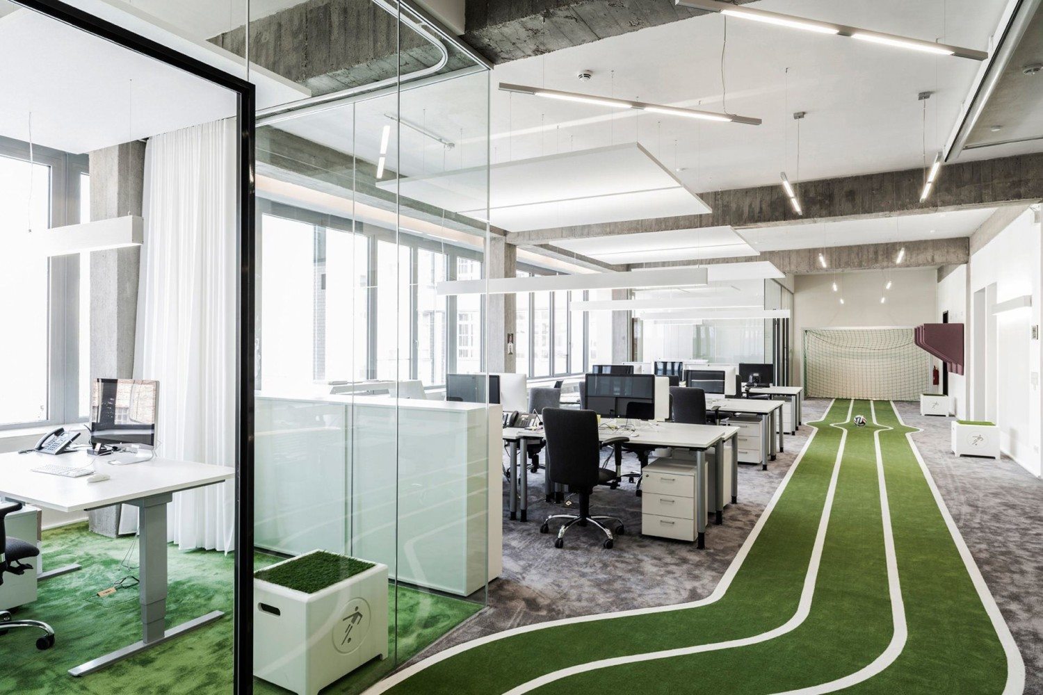
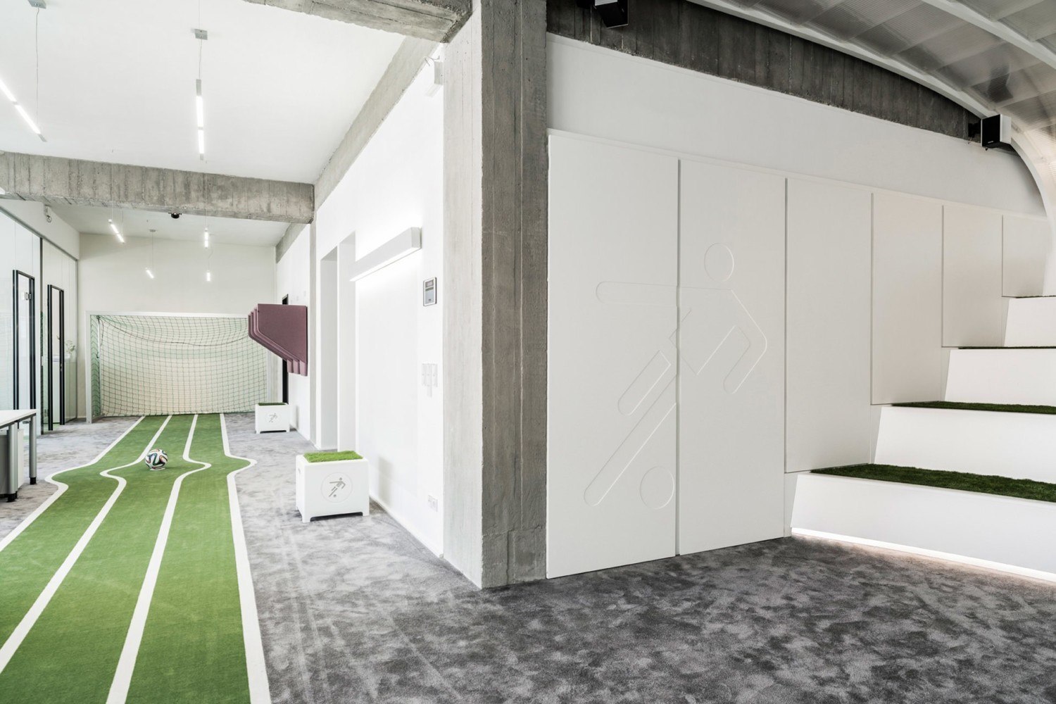
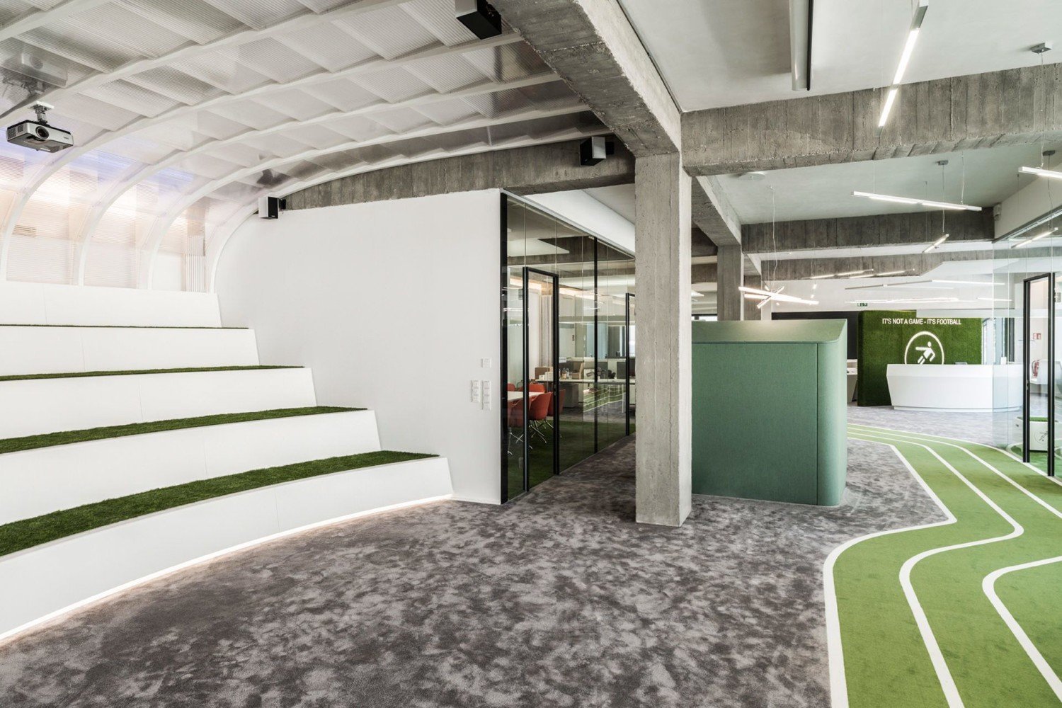
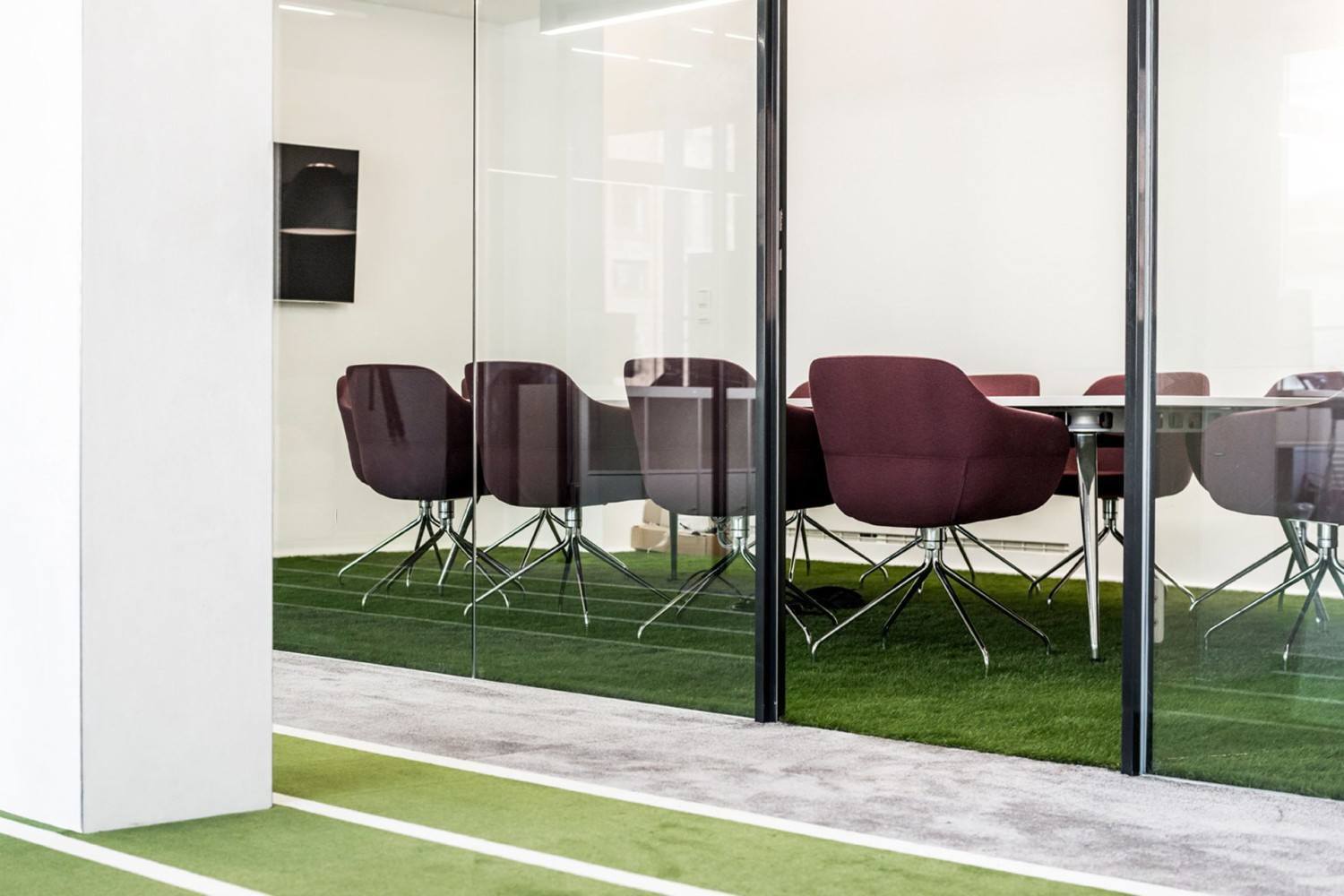
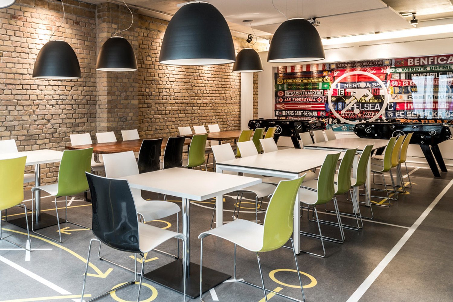
Headquartered in Berlin, Germany, Onefootball (Soccer, for us Americans) is a multimedia platform that connects fans to their teams/players with stats year round. According to TKEZ Architecture, the designers on the project, it was designed to be light, open, and multi-functional to represent the youth of the company and culture. They couldn't be more right. A turf track meanders through the space and terminates at a goal and net for employees to live out their dreams while blowing off some steam. Turf is also used throughout the work spaces to keep the business of sport in front of mind at all times. With glass partition walls everywhere, natural light is allowed to permeate the entire building and keeps the office vibrant and alive throughout the day.

Toms
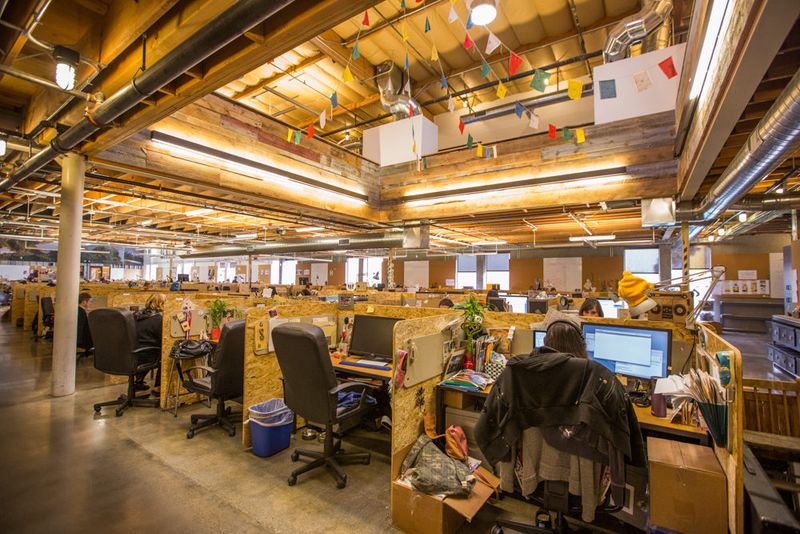
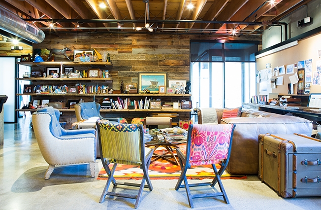
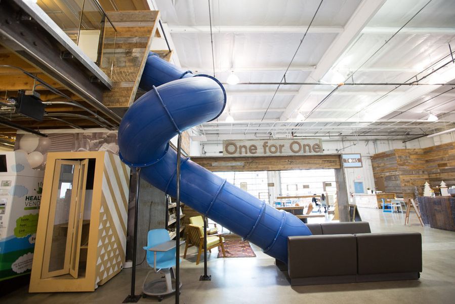
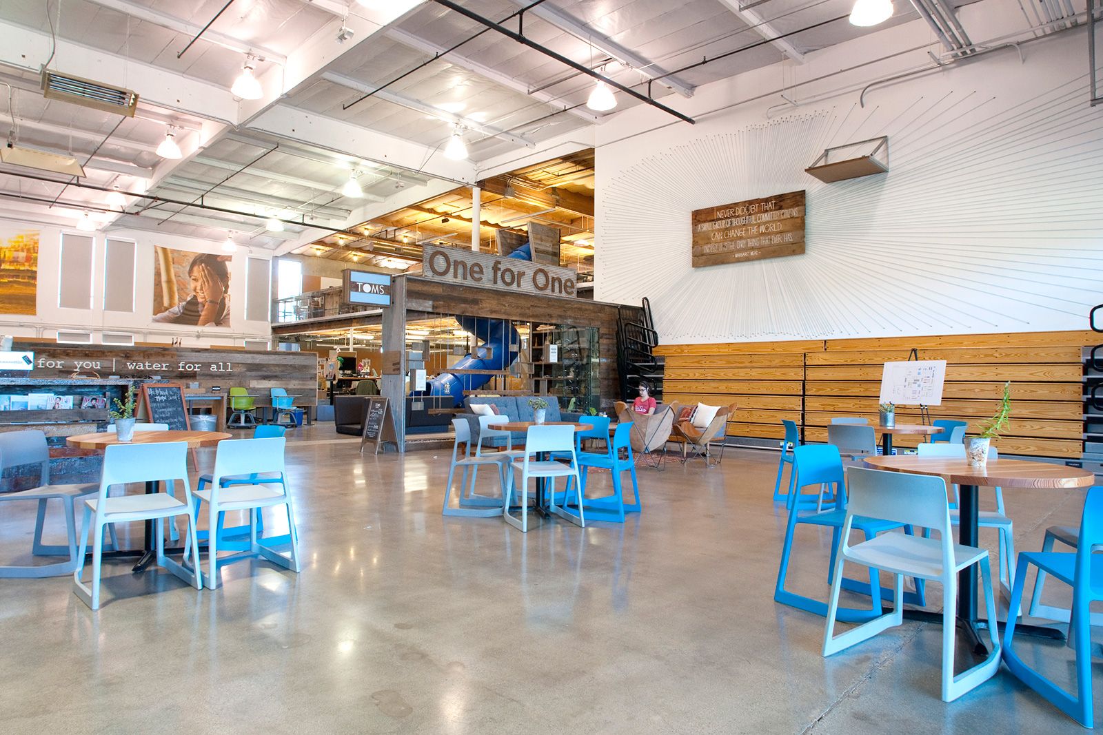
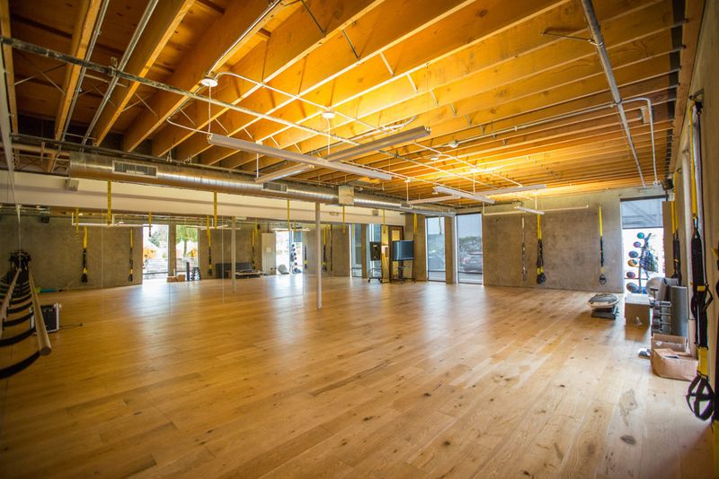
One thing almost every Tom's employee claims as a benefit of working at their new HQ in Marina del Rey, California, is that they all feel at home there. Looking through the pictures you can see why! 'Living room' areas with couches, club chairs, and rugs, their own coffee bar, tents in the 'back yard,' a full gym, slides as the best means to get downstairs, and they're even dog friendly!
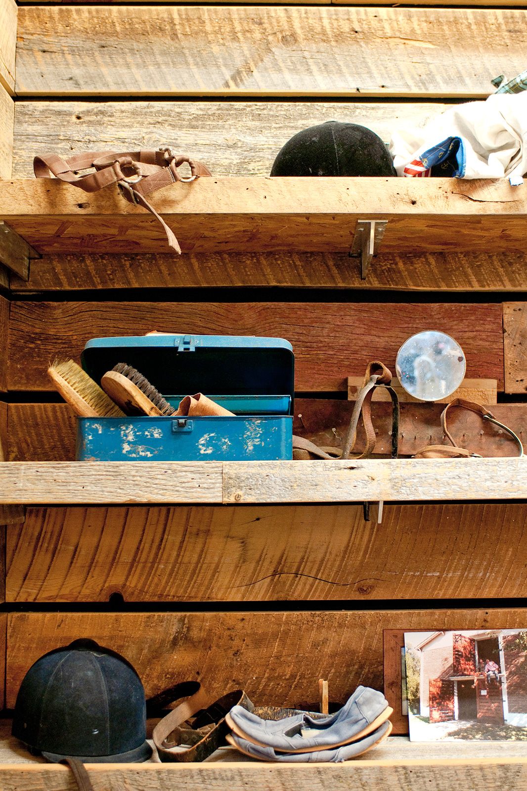
Tom's put a premium on cooperative work, and they encourage doing that work away from your own desks as much as possible. By keeping the spaces open and including as many small 'living room' areas as possible, they've made it comfortable for employees to do just that. Their well-adorned shelves, with carefully selected trinkets, add to the warm, family-friendly environment and make spending your time there enjoyable, as well as rewarding.


Selgascano
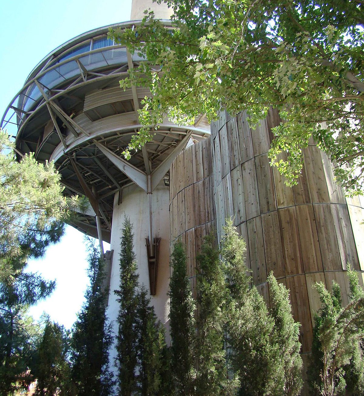
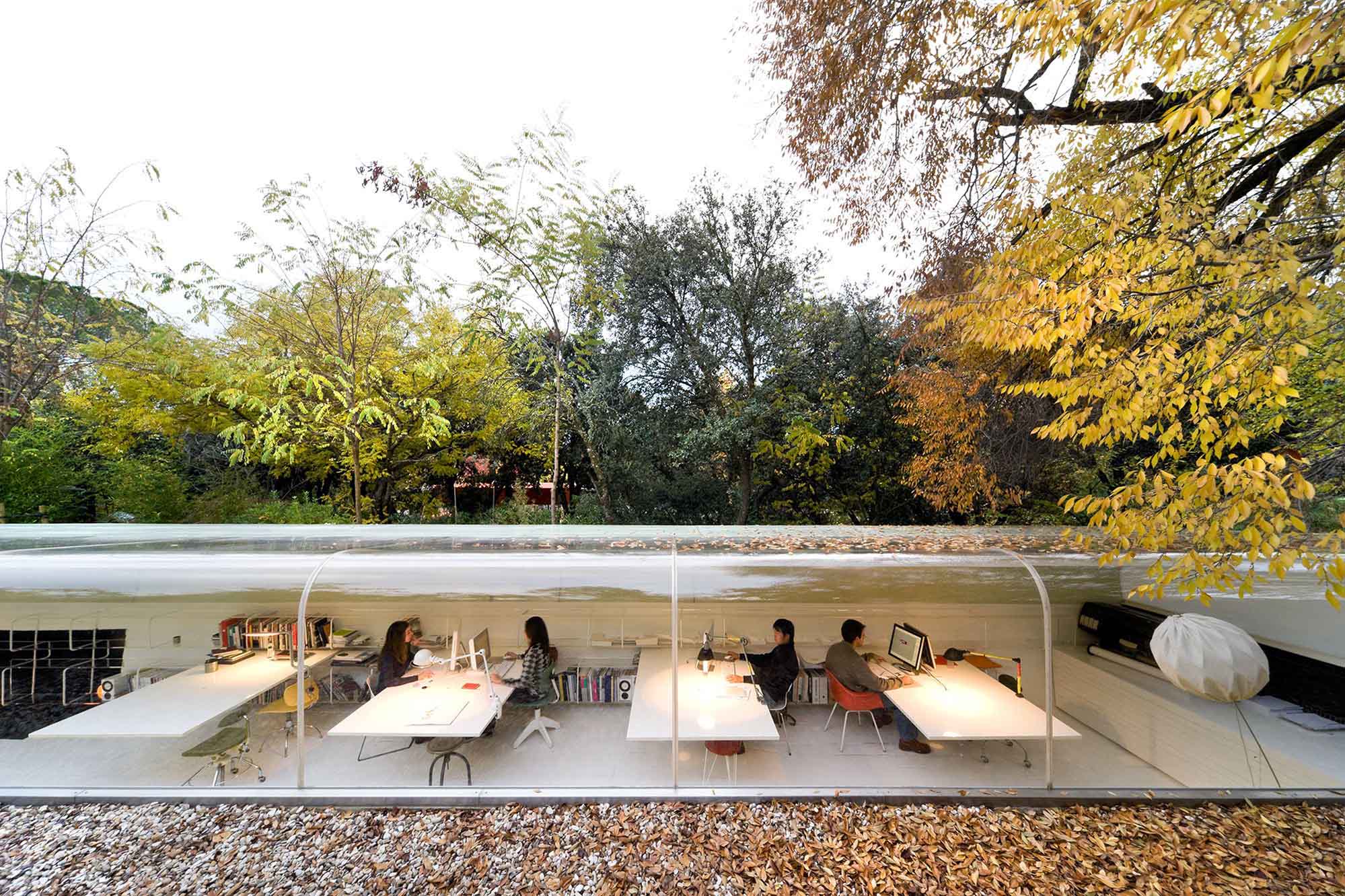
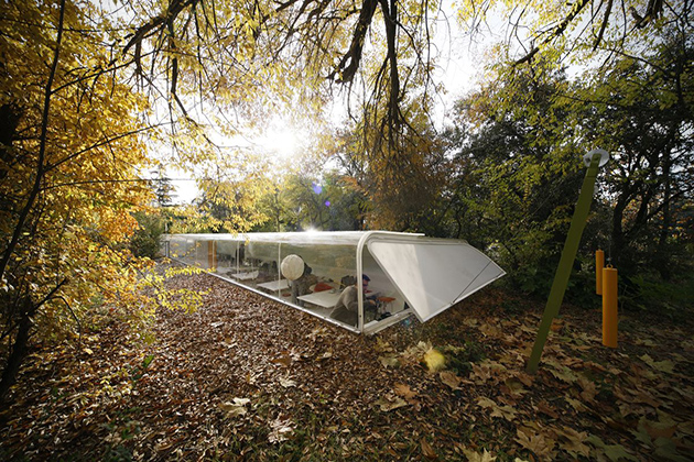
An architecture firm in Madrid, Spain, Selgascano has essentially dug a shallow hole to drop their office right into. Having half the building in the ground keeps the building temperate during the extremes of summer and winter. They've also allowed plenty of light to enter the office by curving the large main window up and rounding it over the top of the building, which also gives the employees wonderful views of the forest canopy above. The large amounts of natural light keeps the lights off more often than not which has a positive affect on productivity during the work day and improves overall performance.


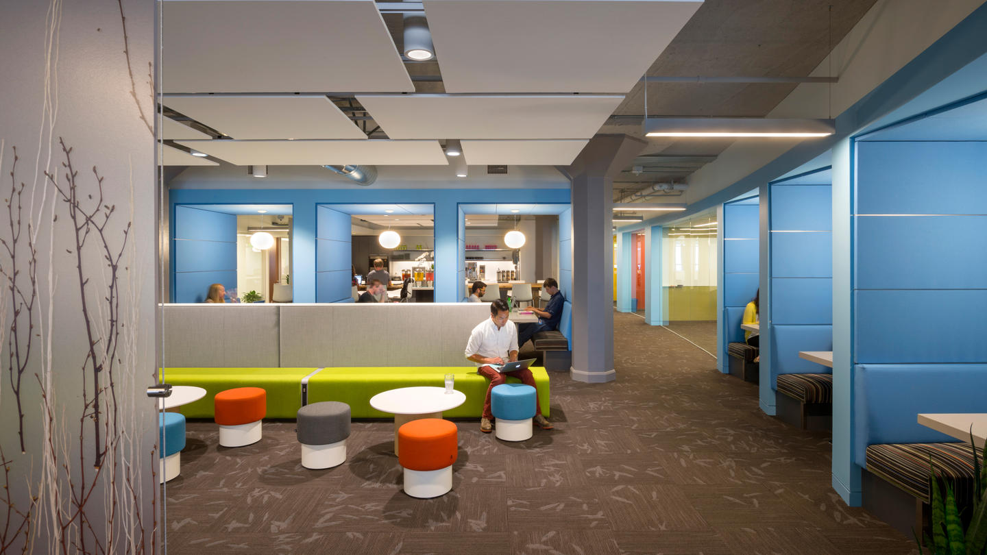
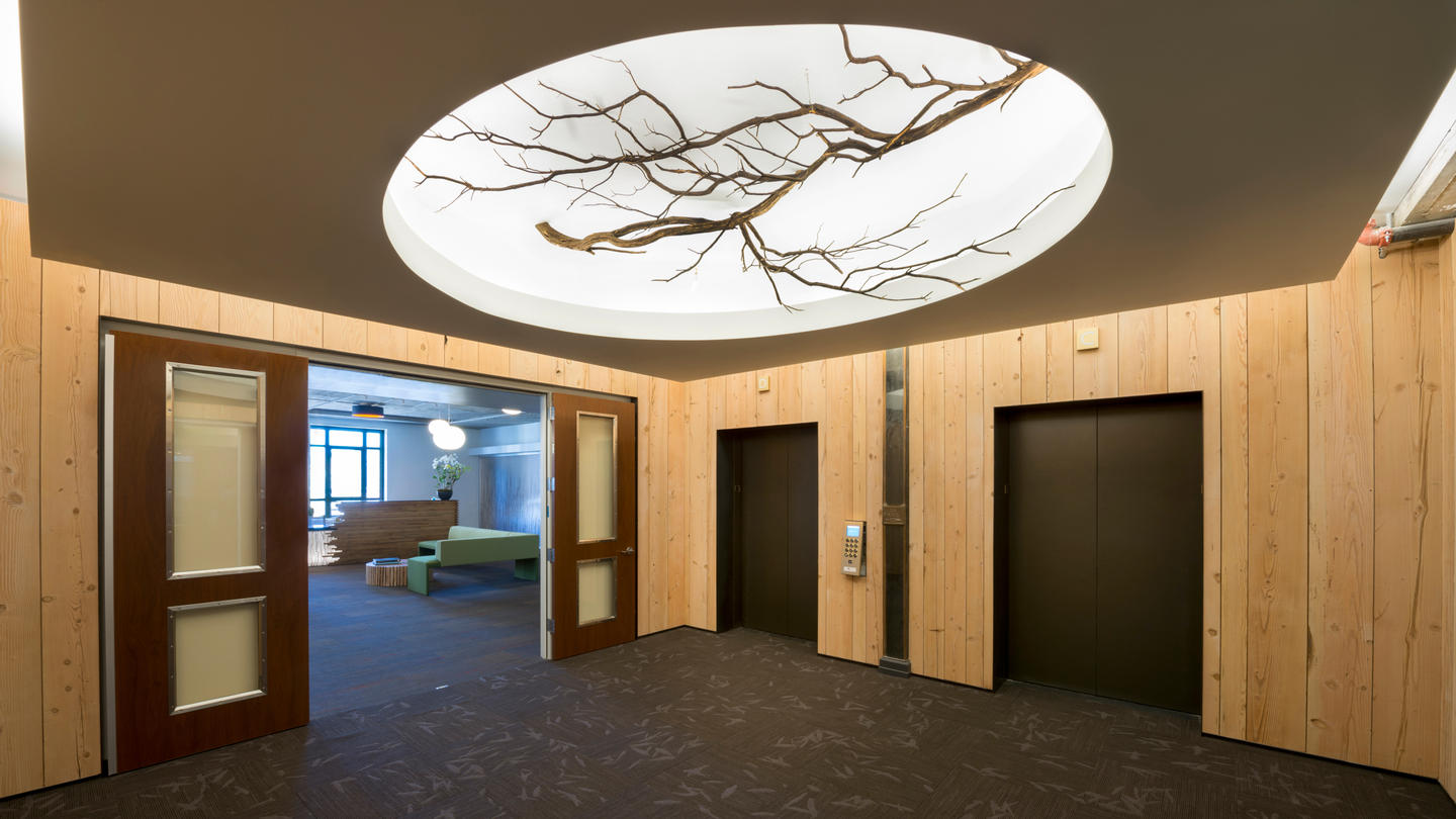
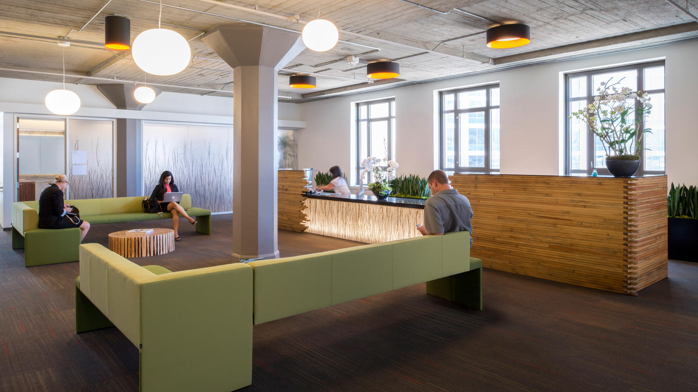
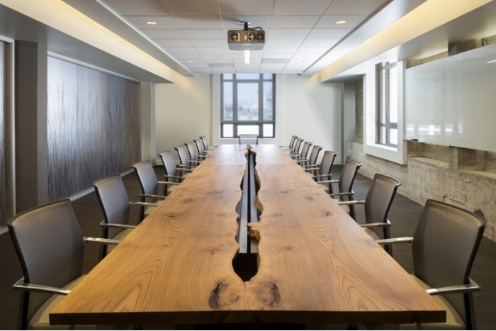
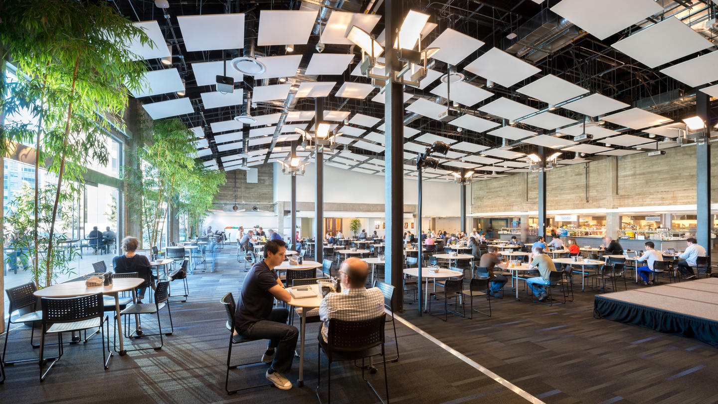
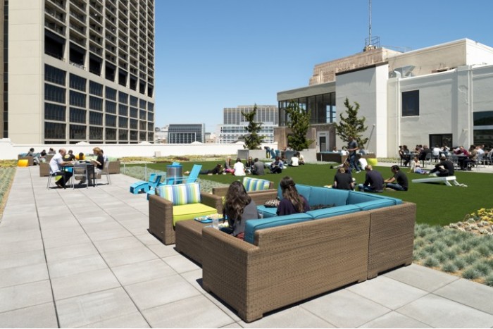
Like most tech companies these days, Twitter has gone away from the hyper-contemporary, white and chrome motif of the early Apple stores. Instead they've embraced the more natural and earthy feel of their avian logo; large, open expanses peppered with conference rooms, cooperative work spaces, lounge areas, and kitchen/dining areas, and a wide open roof terrace, all carefully branded with the Twitter blue, pops of green, plenty of wood and a repeated twig motif. Their main cafeteria is even known as 'the Perch!' By modernizing a typically 'outdoorsy' feel, the designers, IA Interior Architects, in collaboration with Lundberg Design, have successfully created a space that reflects Twitter's creative culture.

Spotify
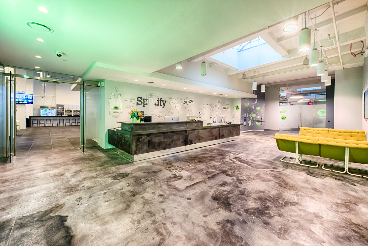
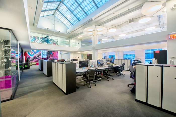
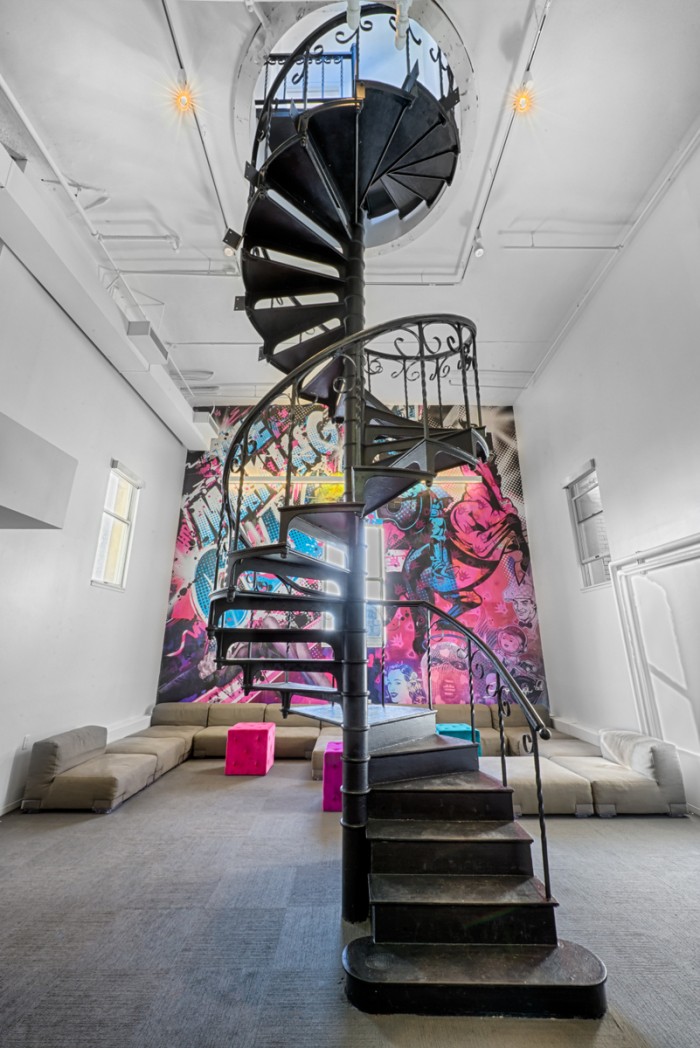
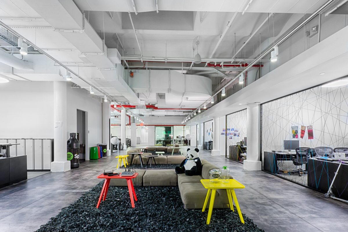
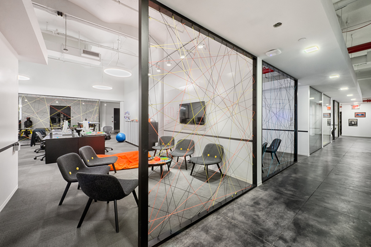
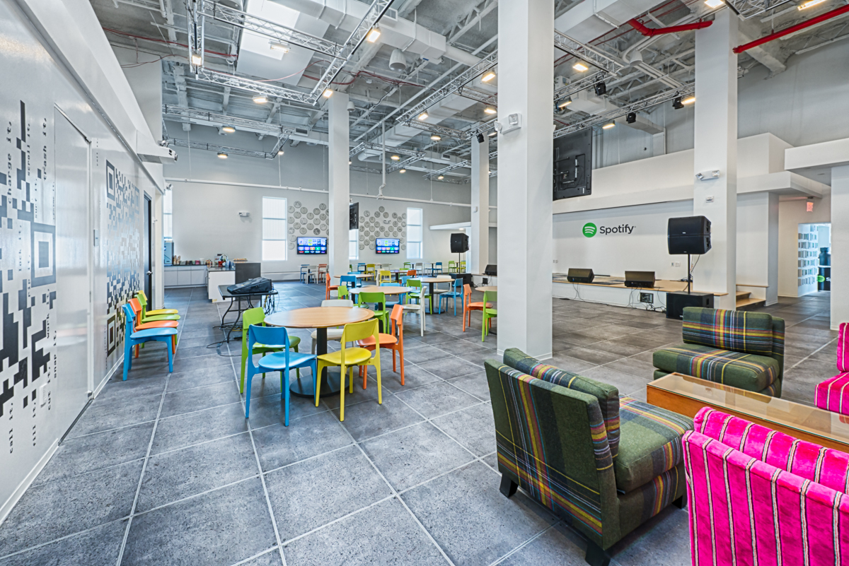
Spotify's Headquarters in New York City is a shining example of what a dedicated and driven person can do in design, without having been formally trained. The entire office was designed in-house by Spotify's very own employees. Custom artwork abound in the building (most are musically influenced, for good reason) and splashes of color are hard to miss, whether on the walls or on the furniture. A large open main work space is flooded with natural light from skylights above, and smaller co-op rooms dot the office to get people moving around. Speaking of moving around, this is the largest installation of Airtouch height-adjustable tables in the entire state (397 of them, to be exact). Partial walls made of metal frames and filled in with colored string do a great job of creating a sense of privacy, but also making sure everyone is available if needed. While they were at it, the employee-designers included a performance stage in their open dining area. Because when you're a music streaming company, you play music!
Bonus! 3 Cool Re-purposed Buildings For New Offices!
TBWA/Hakuhodo
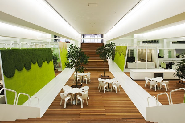
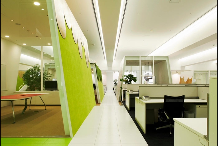
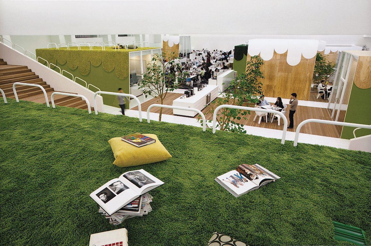
Two of Japan's leading advertising agencies teamed up for new offices in Tokyo and took over what used to be a bowling alley in a large eight-story amusement complex. The large open space made for a completely open floor plan of work space, separated only by grassy 'hills' that rise from the floor and house cooperative work space and other offices. You can even congregate on top of the 'hills' for a little break from work!
Dogpatch Labs
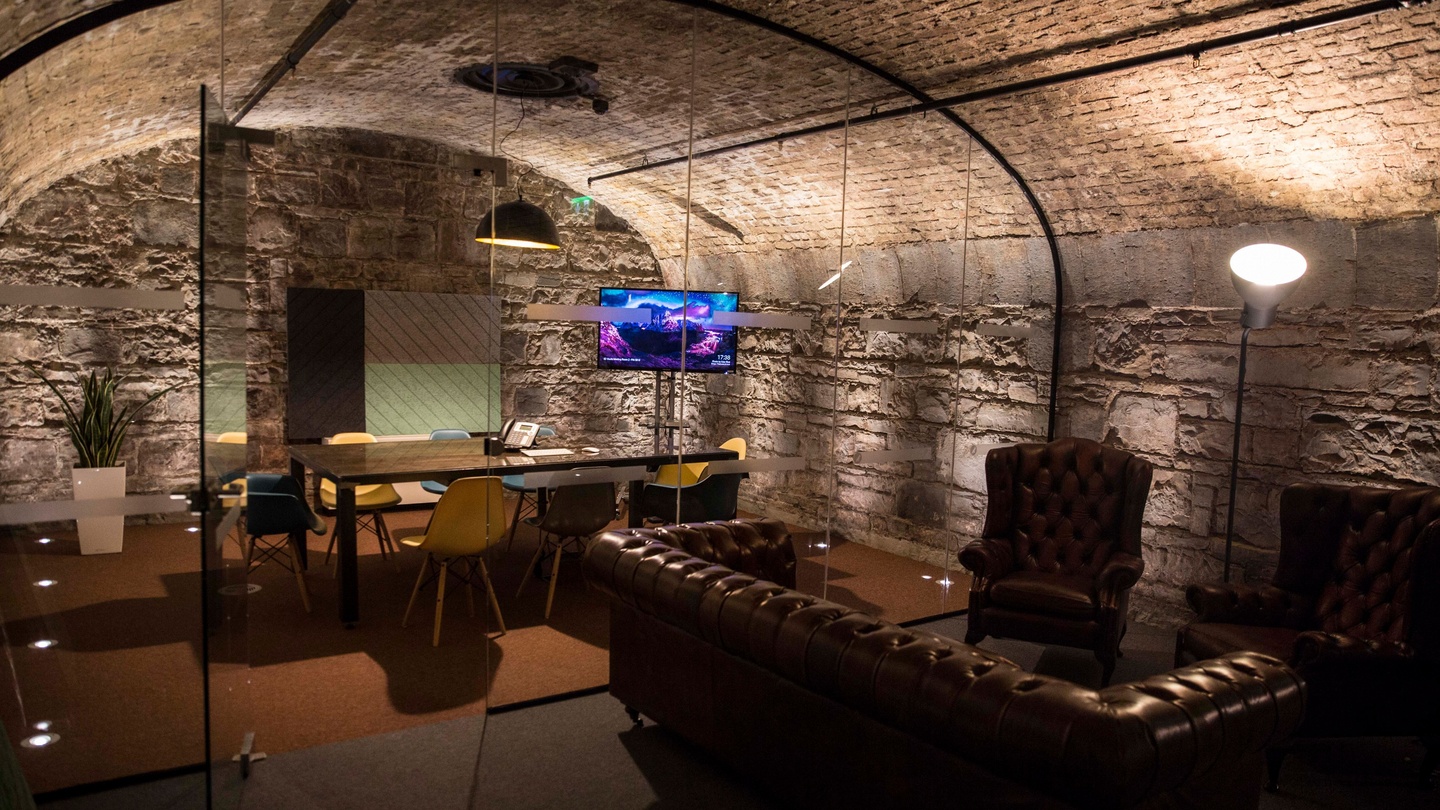
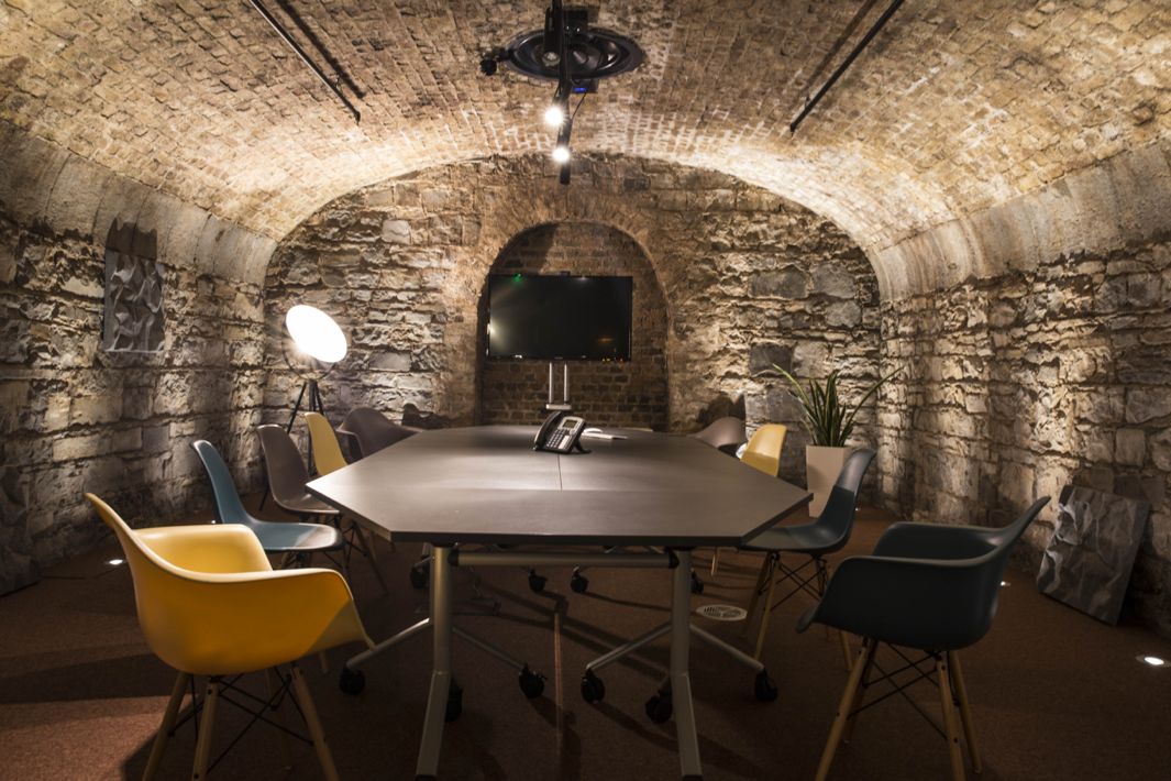
A co-working, tech-centric office for tech start-ups, Dogpatch Labs has built a new space in the docklands of Dublin for anyone in need of an office. The best part? They've expanded to the cellar. You can work in an old wine vault!
Ricardo Bofill
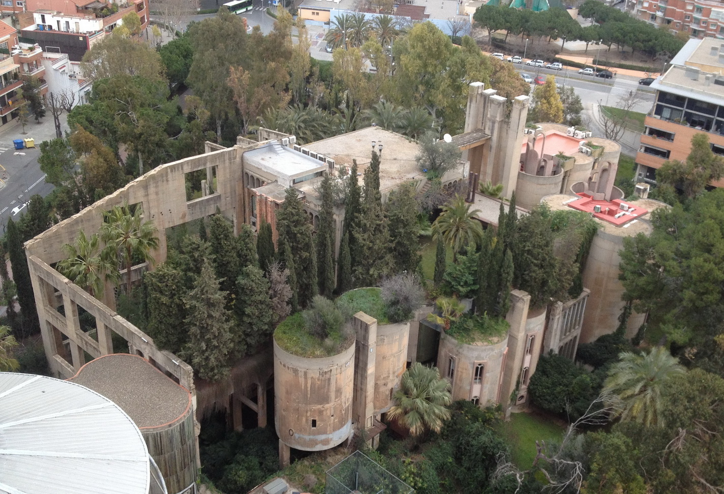
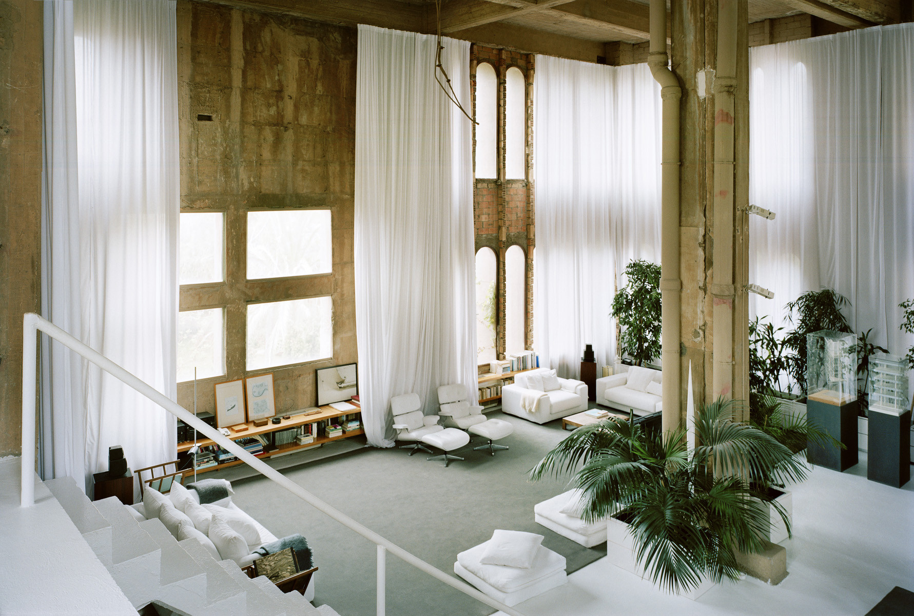
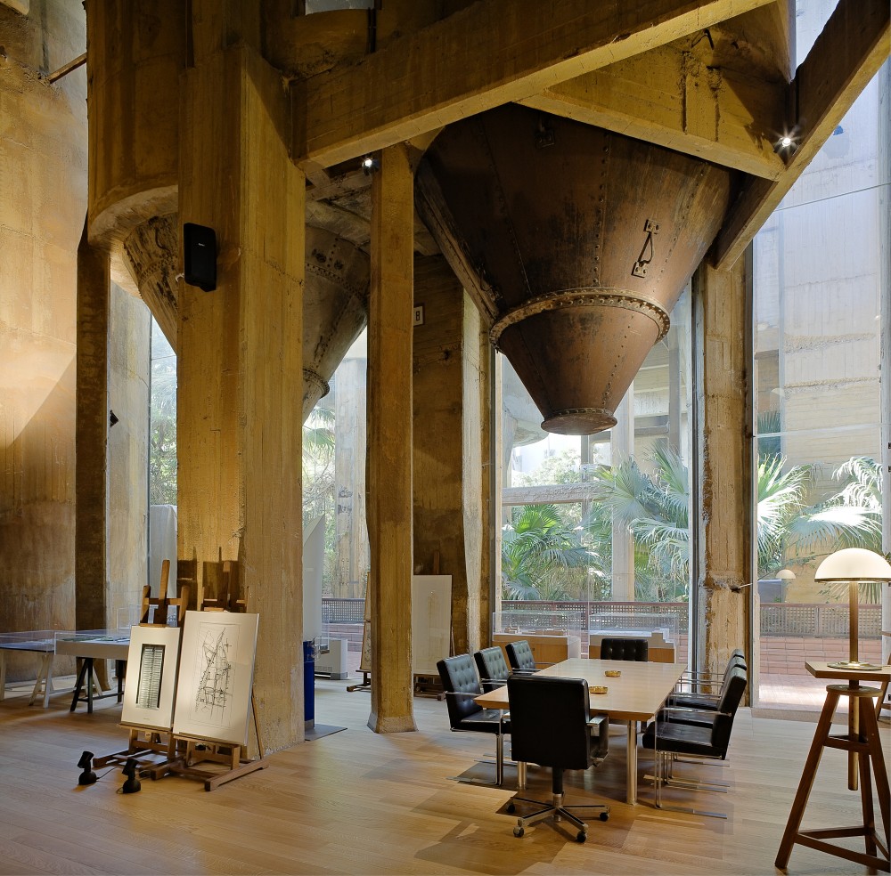
Architect Ricardo Bofill took an abandoned cement factory in Spain and turned it into a surreal work of workplace art. The existing cement silos became offices, libraries, various meeting spaces, etc. A large machinery room, now known as 'the Cathedral,' is used for concerts and exhibitions. It's a true testament to creativity in design.
